Jobcase is a social media platform dedicated to empowering and advocating for the world’s workers. They develop technology to help people lead better, more meaningful work-lives – providing access to jobs, tools to take action, and a community for support. Jobcase is an affiliate of MIT’s Computer Science and Artificial Intelligence Lab, and partners with employers and nonprofits to expand opportunity for the workforce.
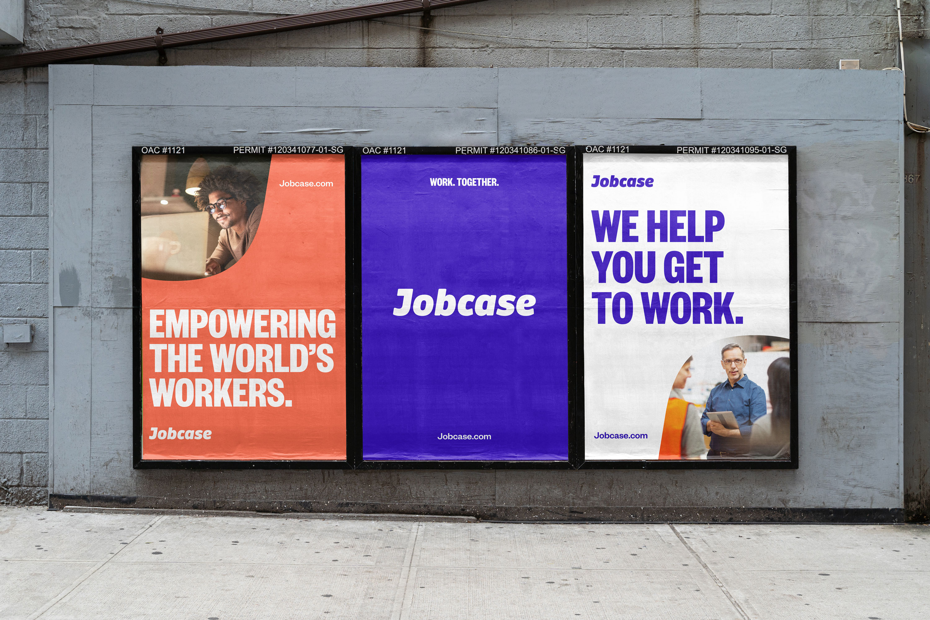
I worked with Teak to build a cohesive brand for Jobcase that would establish them as the go-to community and platform for the worker. With over 100 million users, it was time for Jobcase to present themselves in a way that clearly aligned with their mission.
Work done with Teak.
I worked with Teak to build a cohesive brand for Jobcase that would establish them as the go-to community and platform for the worker. With over 100 million users, it was time for Jobcase to present themselves in a way that clearly aligned with their mission.
Work done with Teak.

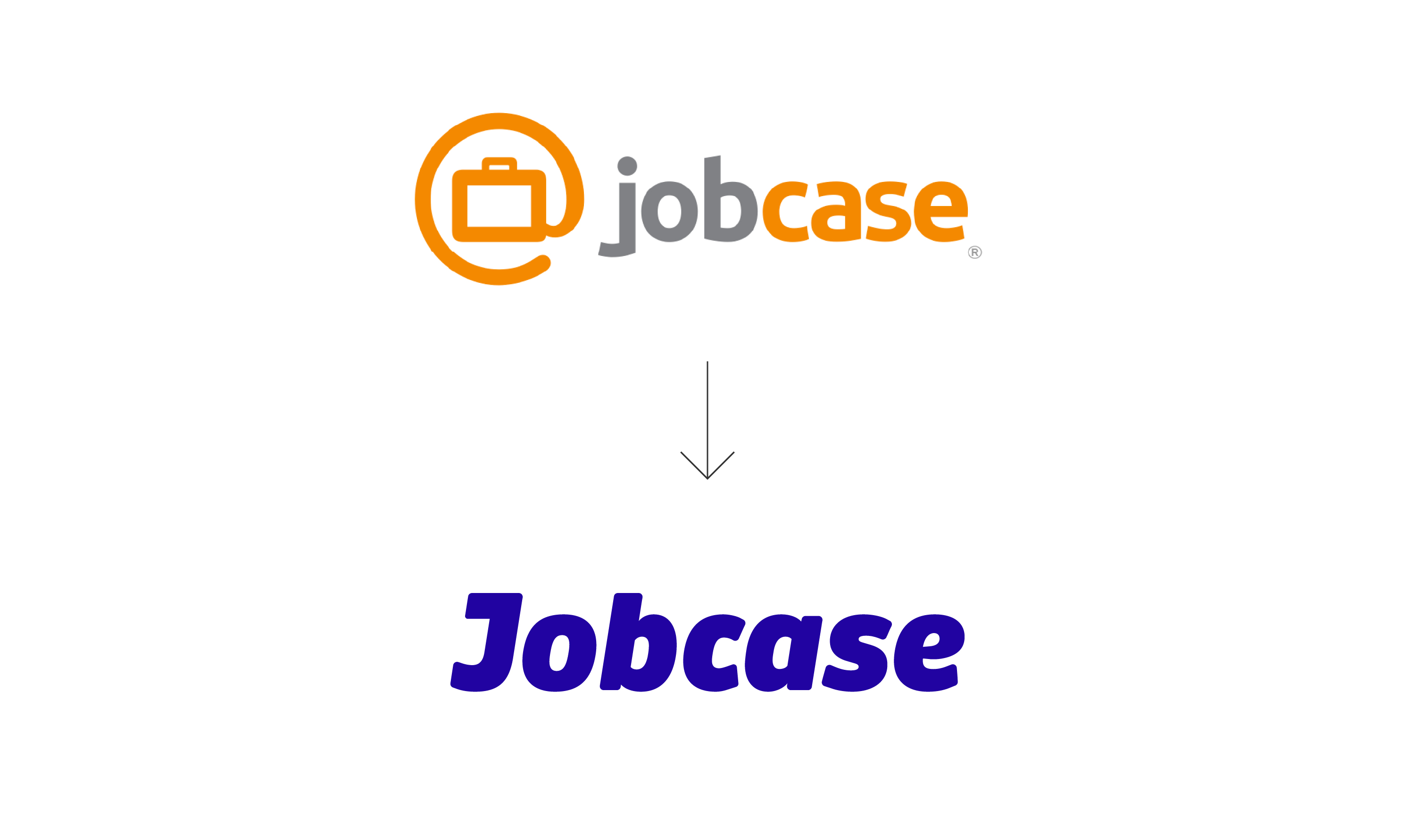
Before/After



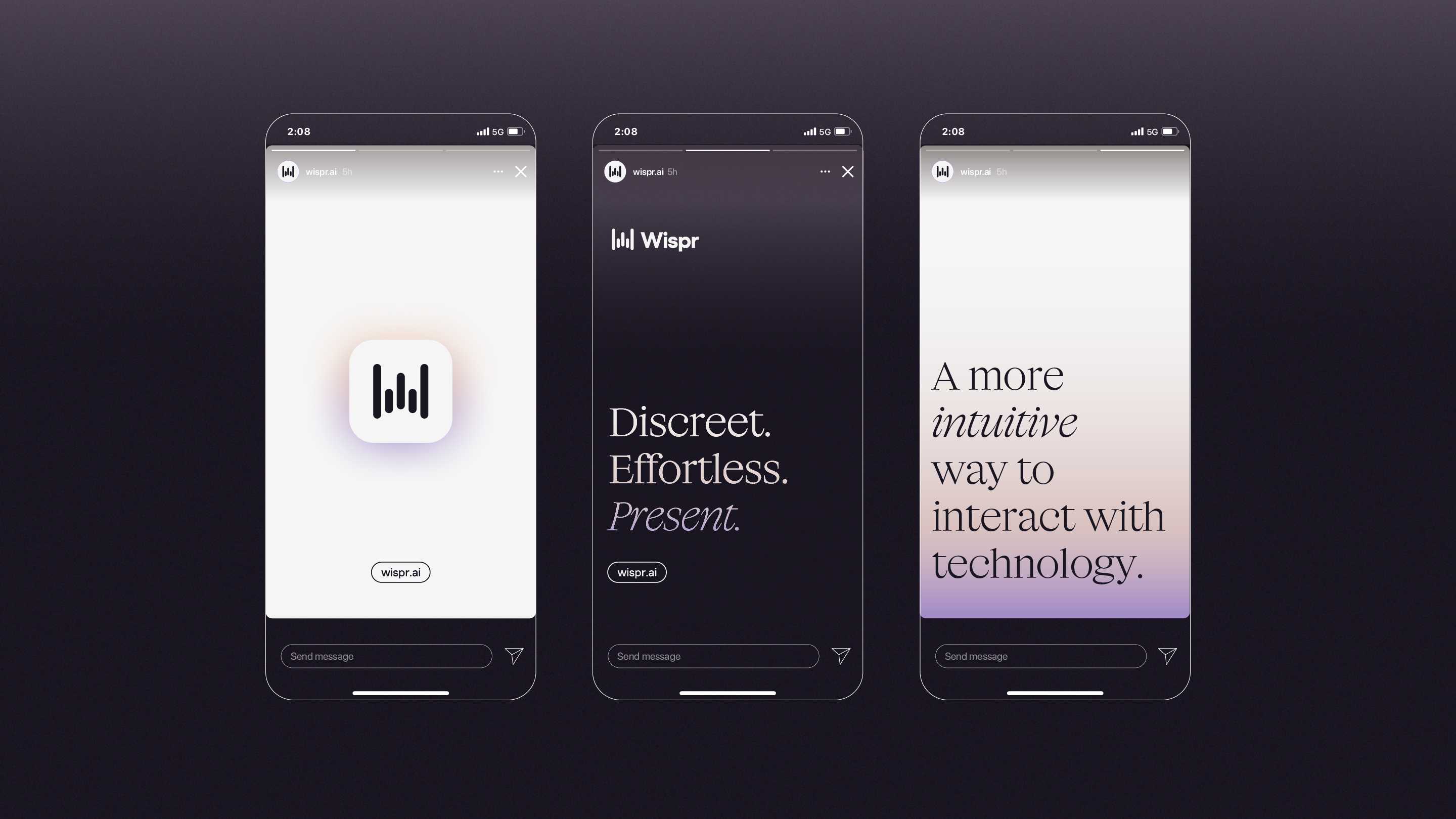
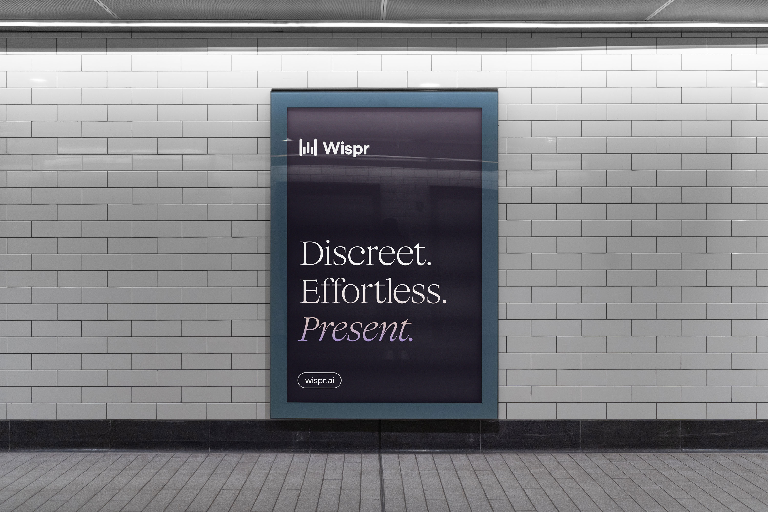
Wispr is reinventing personal computing for an AI-first world with neural interfaces. The company’s human-centered approach lets users interact with technology in a more natural way. Wispr believes in a brighter future for our relationship with technology. In late 2022, they had just come off of a $10M Seed II round from investors including Neo, Triple Point Capital, MVP Ventures, and Fred Ehrsam, the co-founder of Coinbase and Paradigm Ventures. At this inflection point, Wispr was looking to bring their brand identity into more alignment with their goals and company qualities.
I worked with Wispr to refine their logo, dropping the ‘AI’ and cleaning up the alignment and typography. As the centerpoint of the brand, I created a warm gradient, symbolizing the hopeful horizon of our relationship with tech and AI over the coming the coming years. Together, we moved their brand in a much more human and empathetic direction, using color and serif typography to inject humanity, approachability, and warmth to every brand touchpoint.
Webflow Development: Finsweet

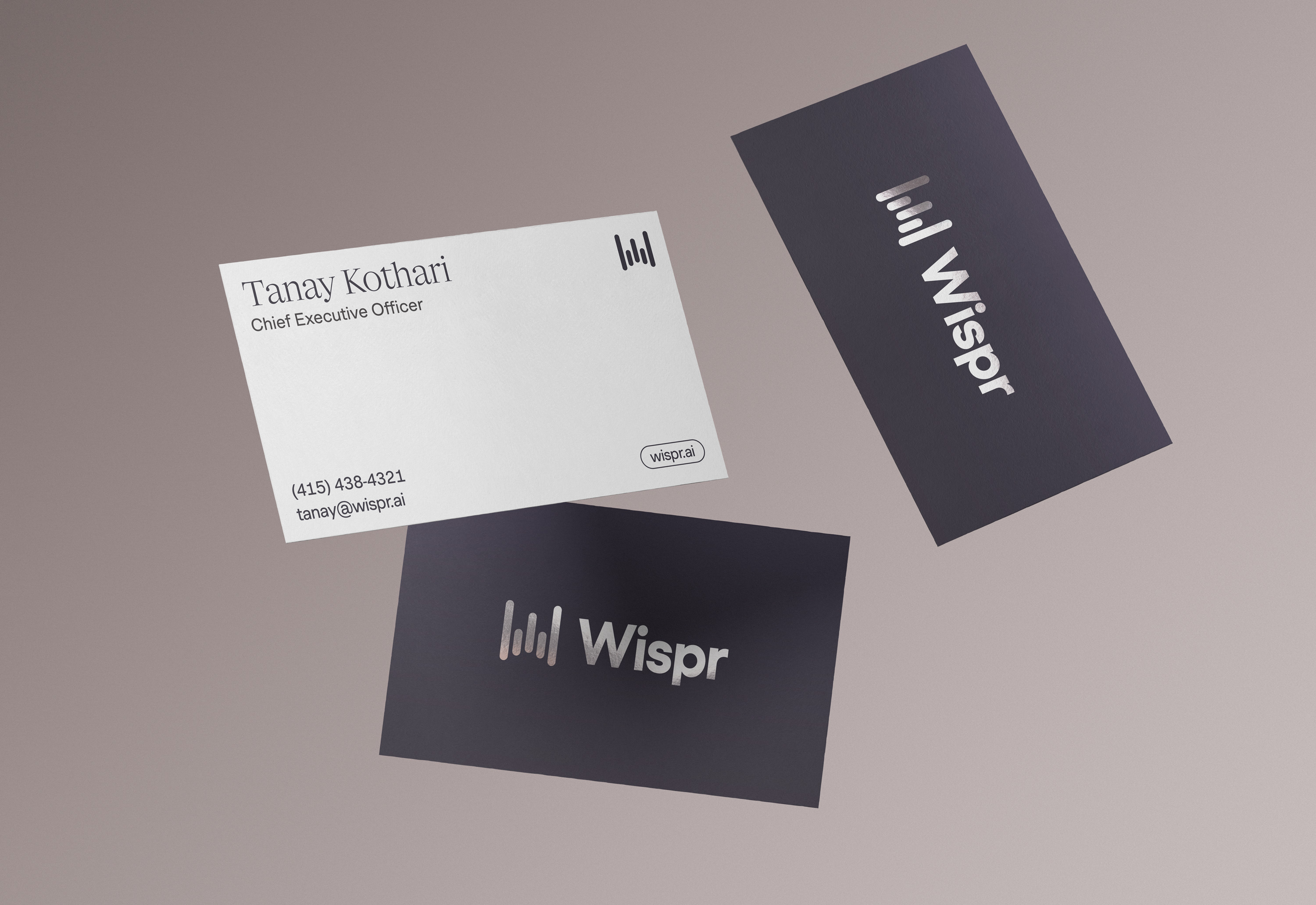

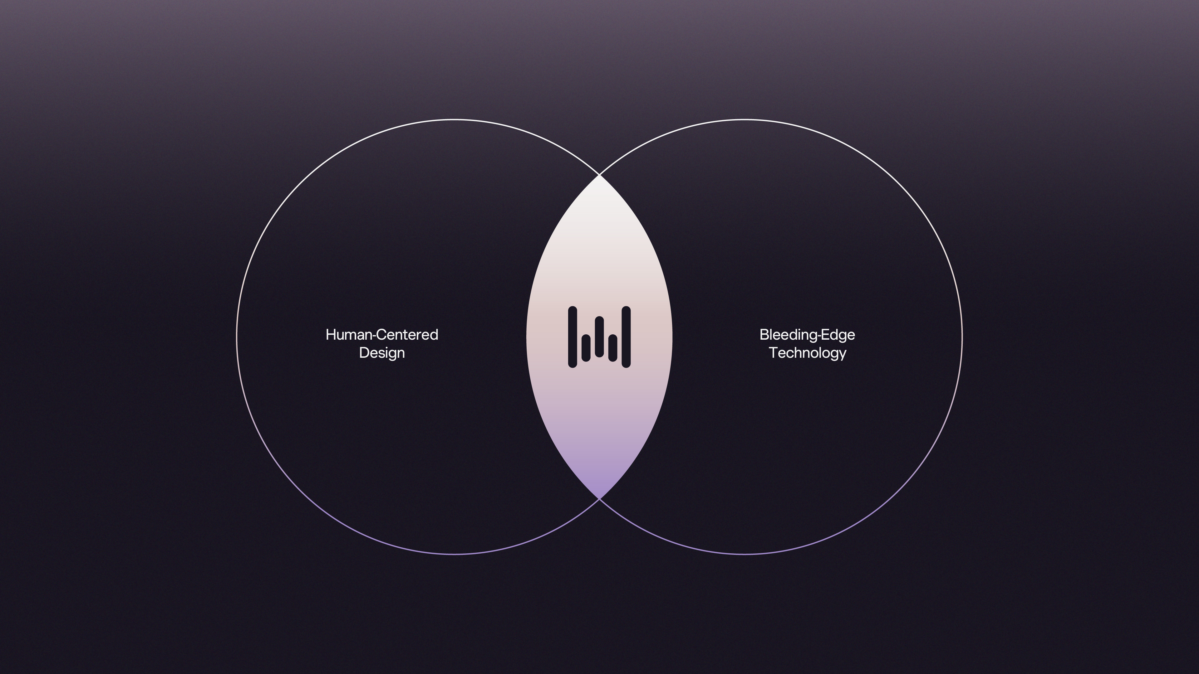

Digital brand guidelines delivered via Standards.


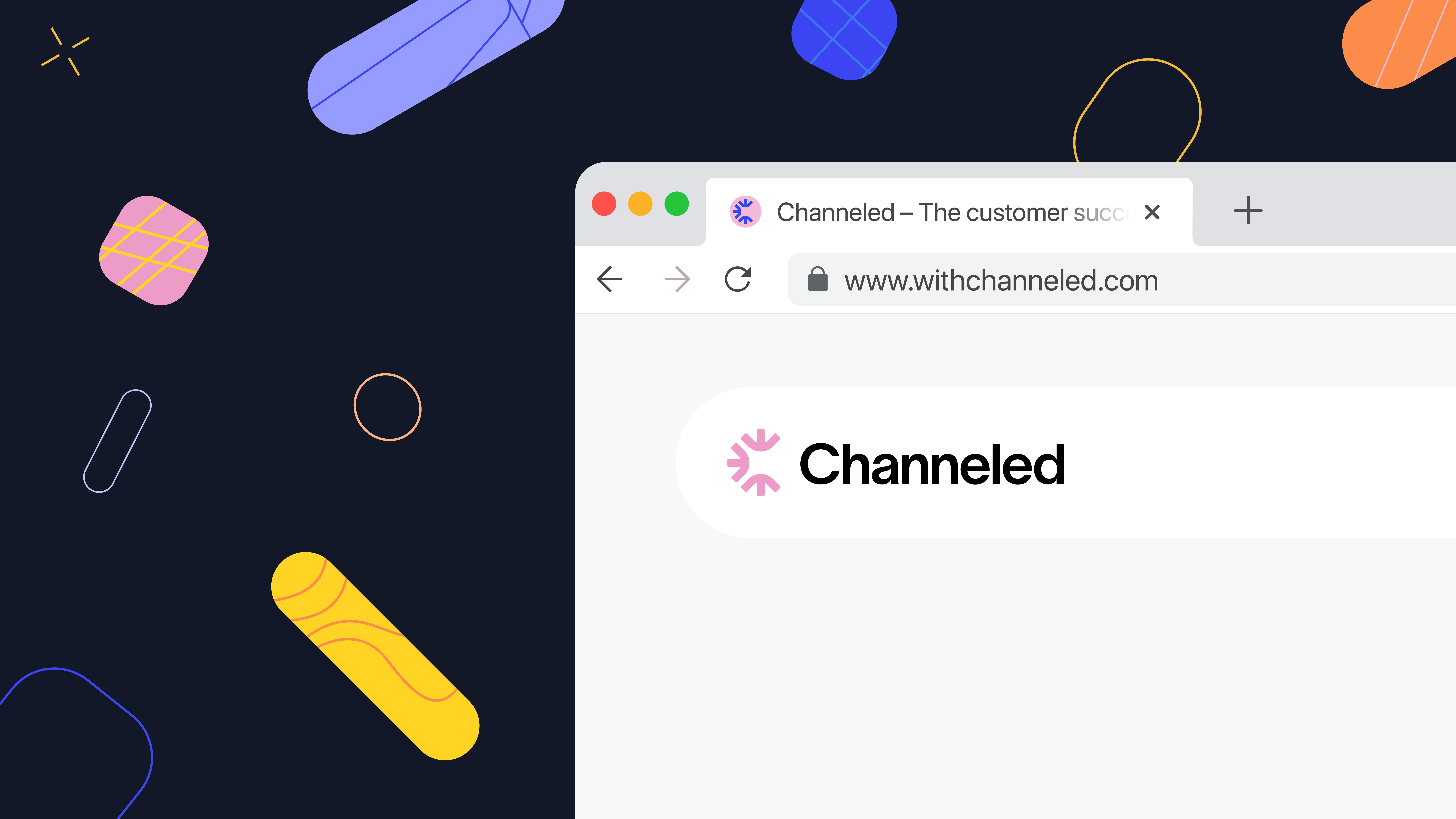
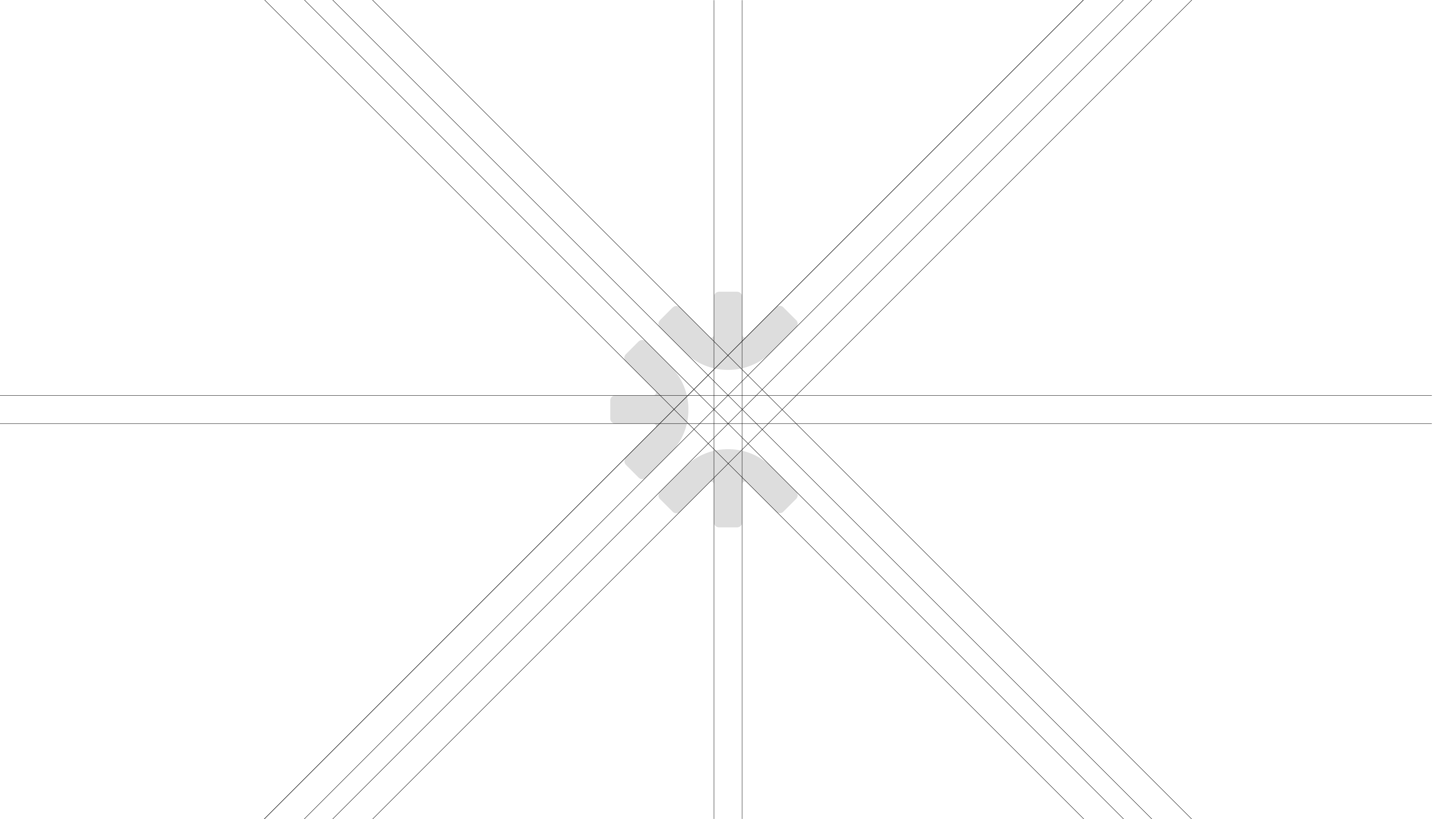
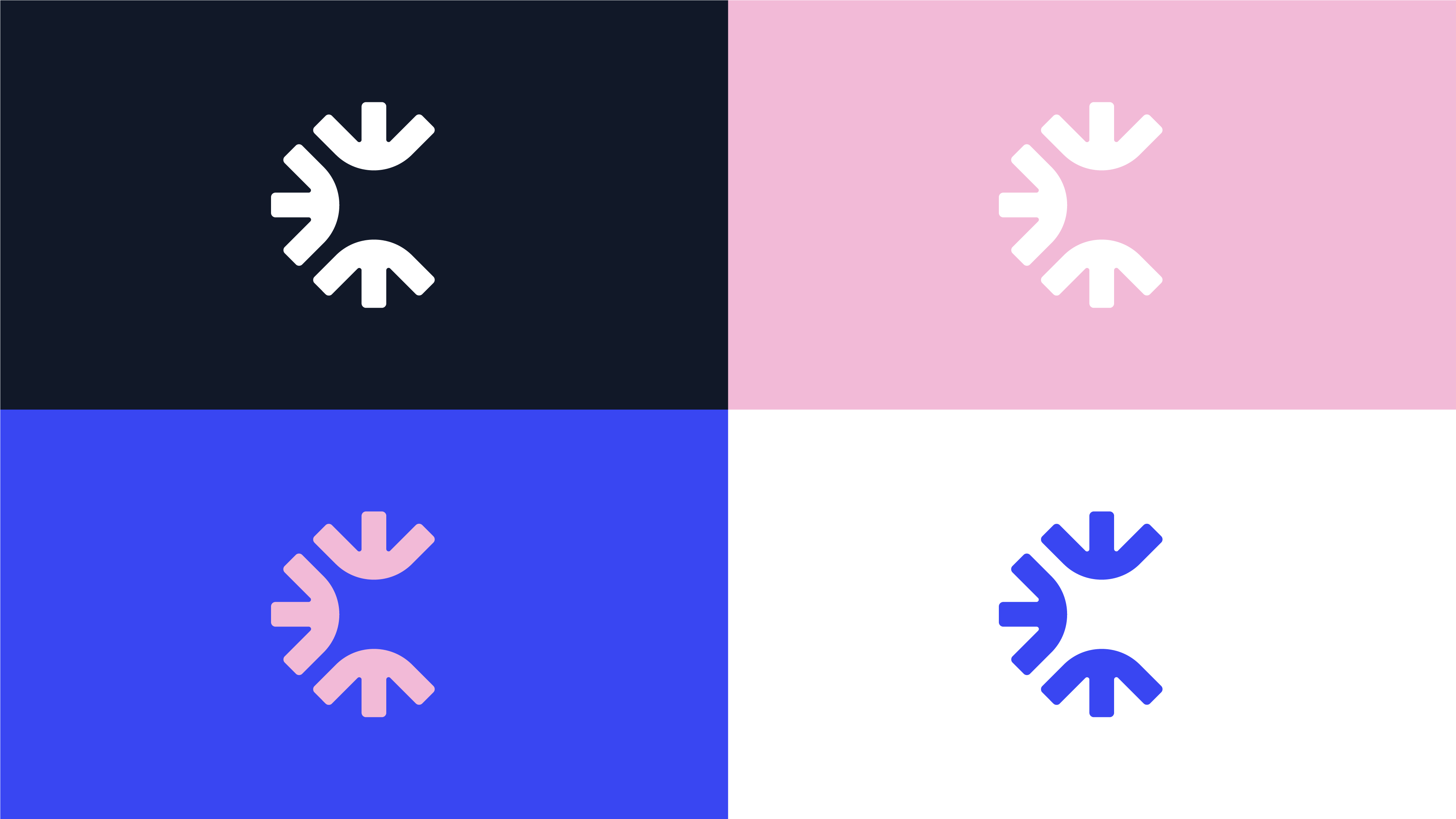
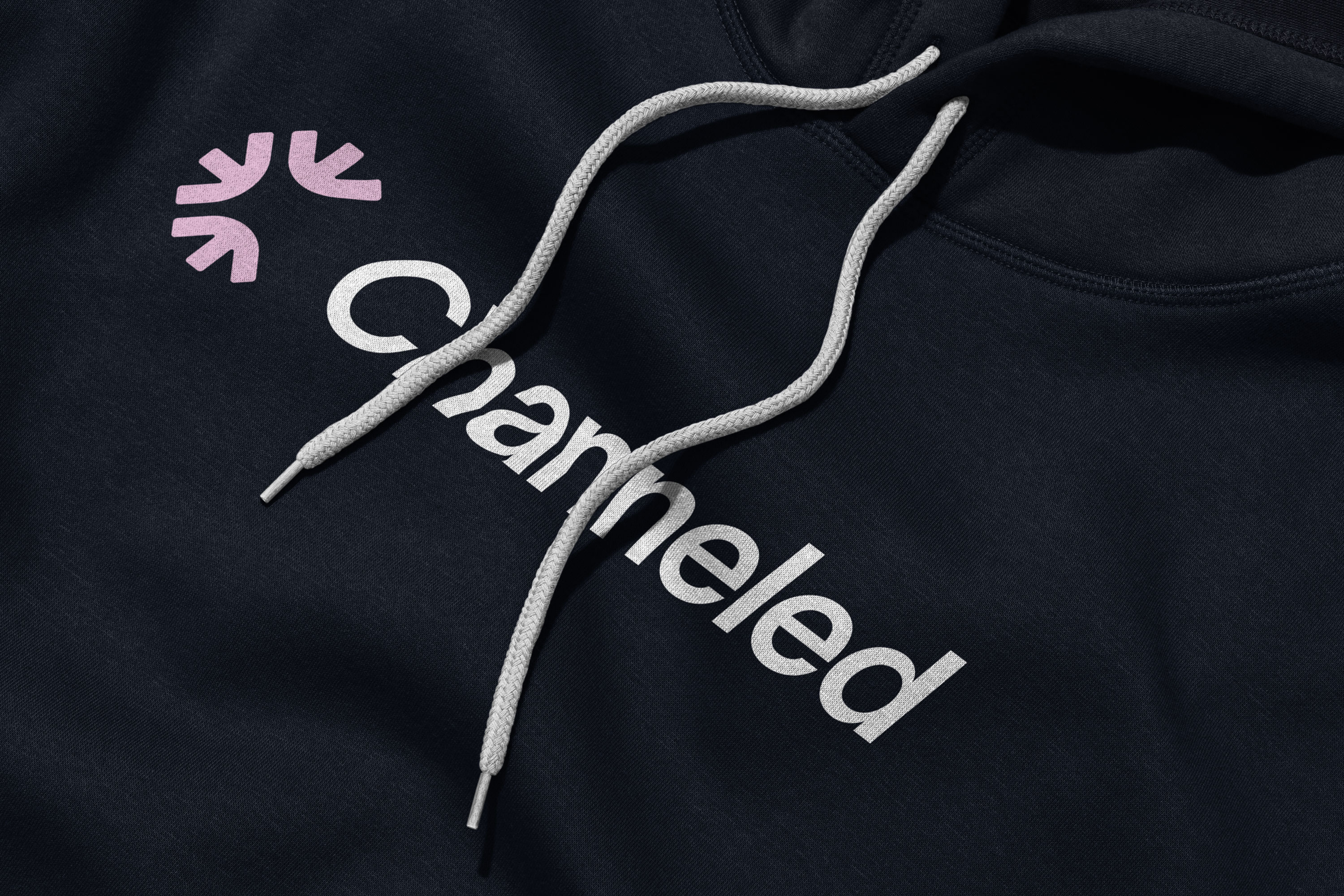
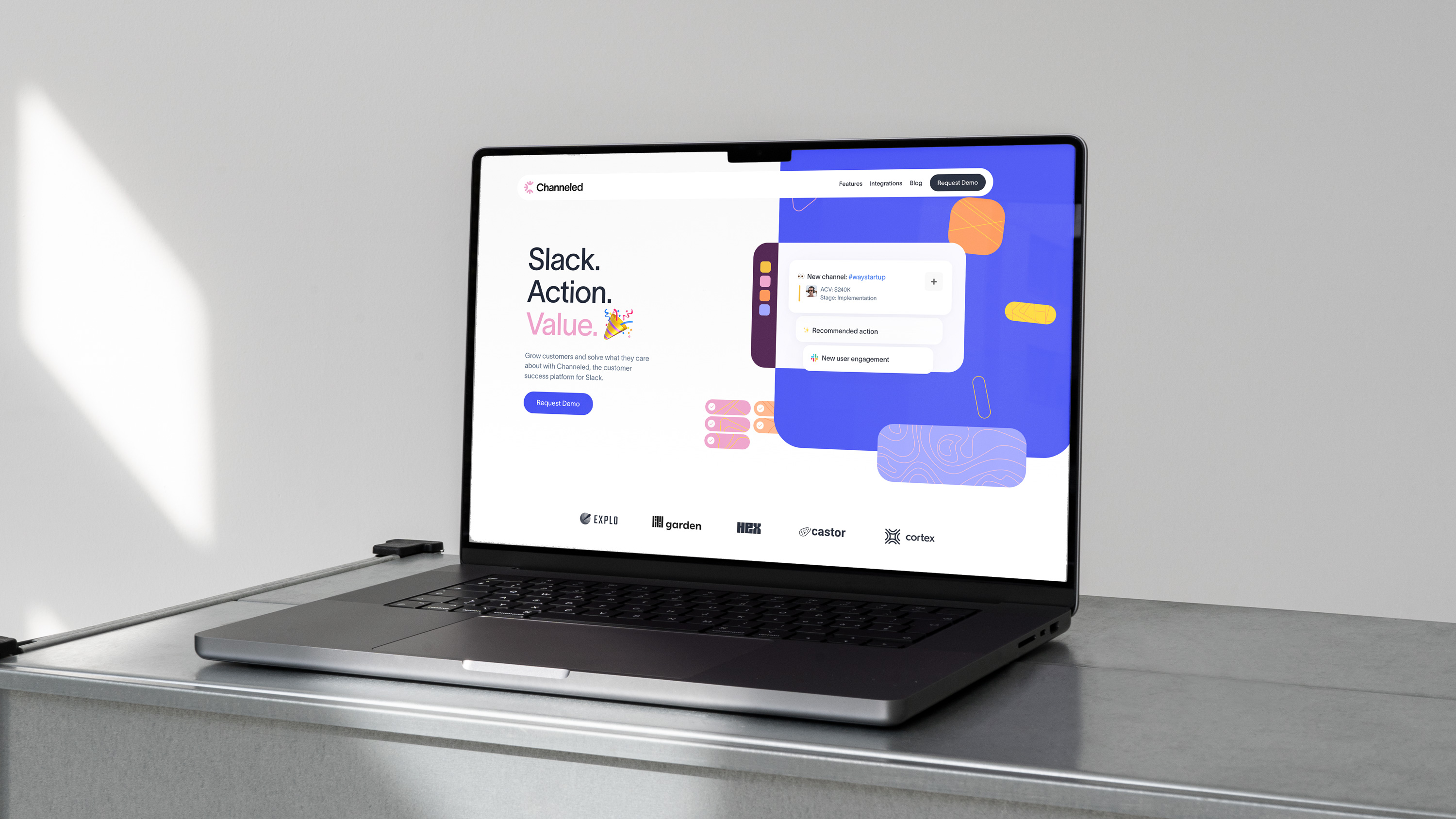
Channeled allows companies to see what’s happening across customer channels in a unified Slack inbox. I worked with Channeled to create a logo design that signaled unification and integration. My partner on the project, Sania Saleh created a brand visual language that emphasized connection and collaboration.
Team:
Web Design & Creative Direction: Sania Saleh
Webflow Development: Koysor Abdul
Team:
Web Design & Creative Direction: Sania Saleh
Webflow Development: Koysor Abdul
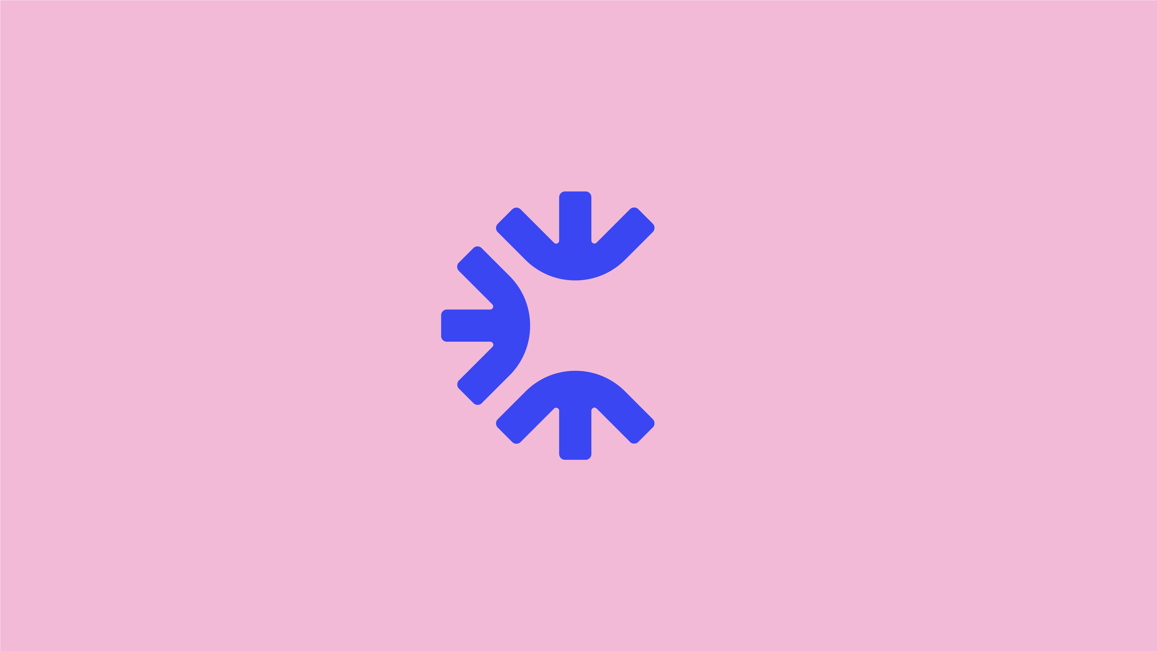
Unused concepts.




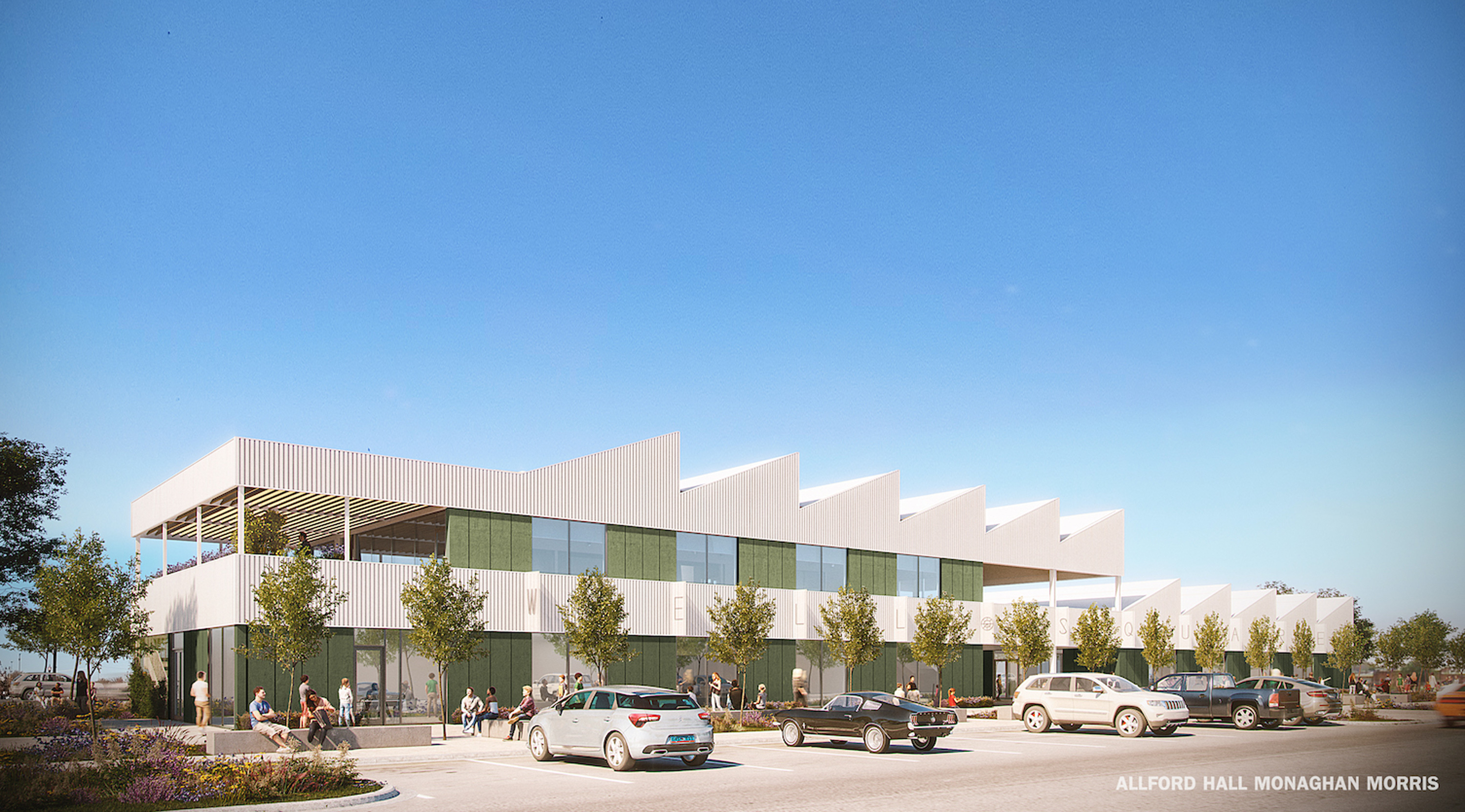
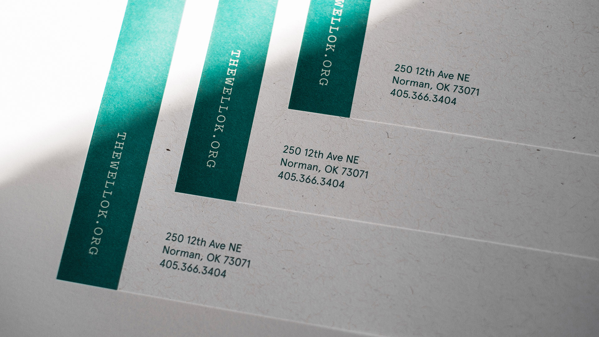
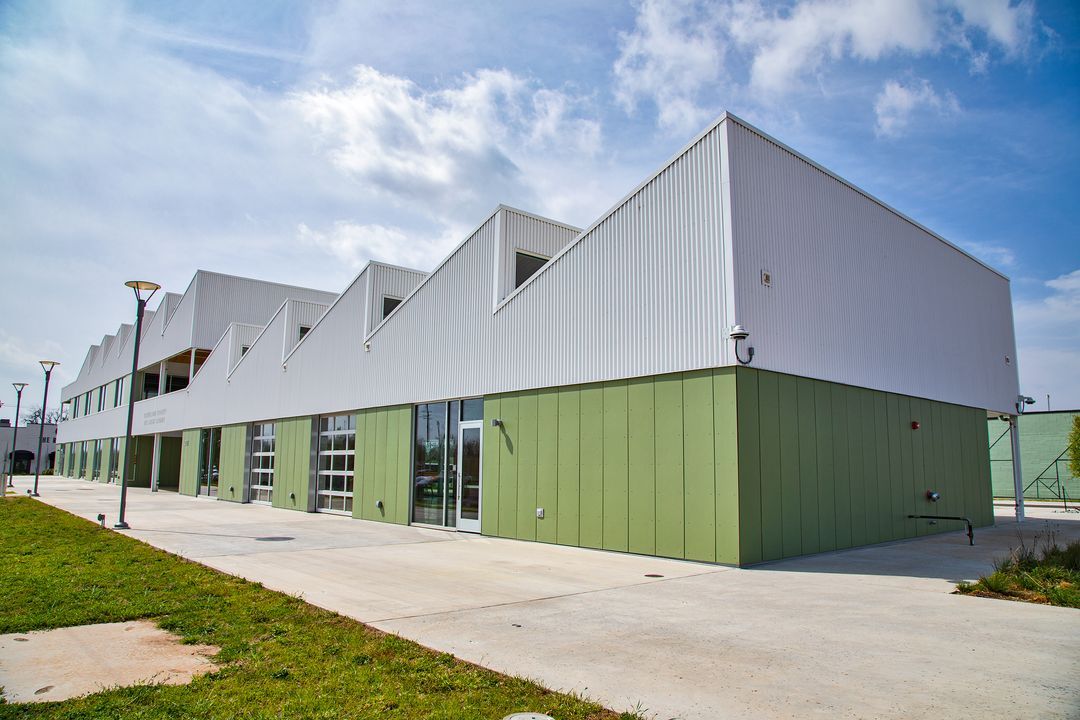
The Well (full name: Cleveland County Wellness Square) is an inclusive wellness hub for all residents of Cleveland County. It provides access to education, programs, events, and activities to make everyone the healthiest and happiest they can be. Located in Norman, Oklahoma, The Well opened in the fall of 2021 and will be the new home for the Norman Farm Market in 2022.
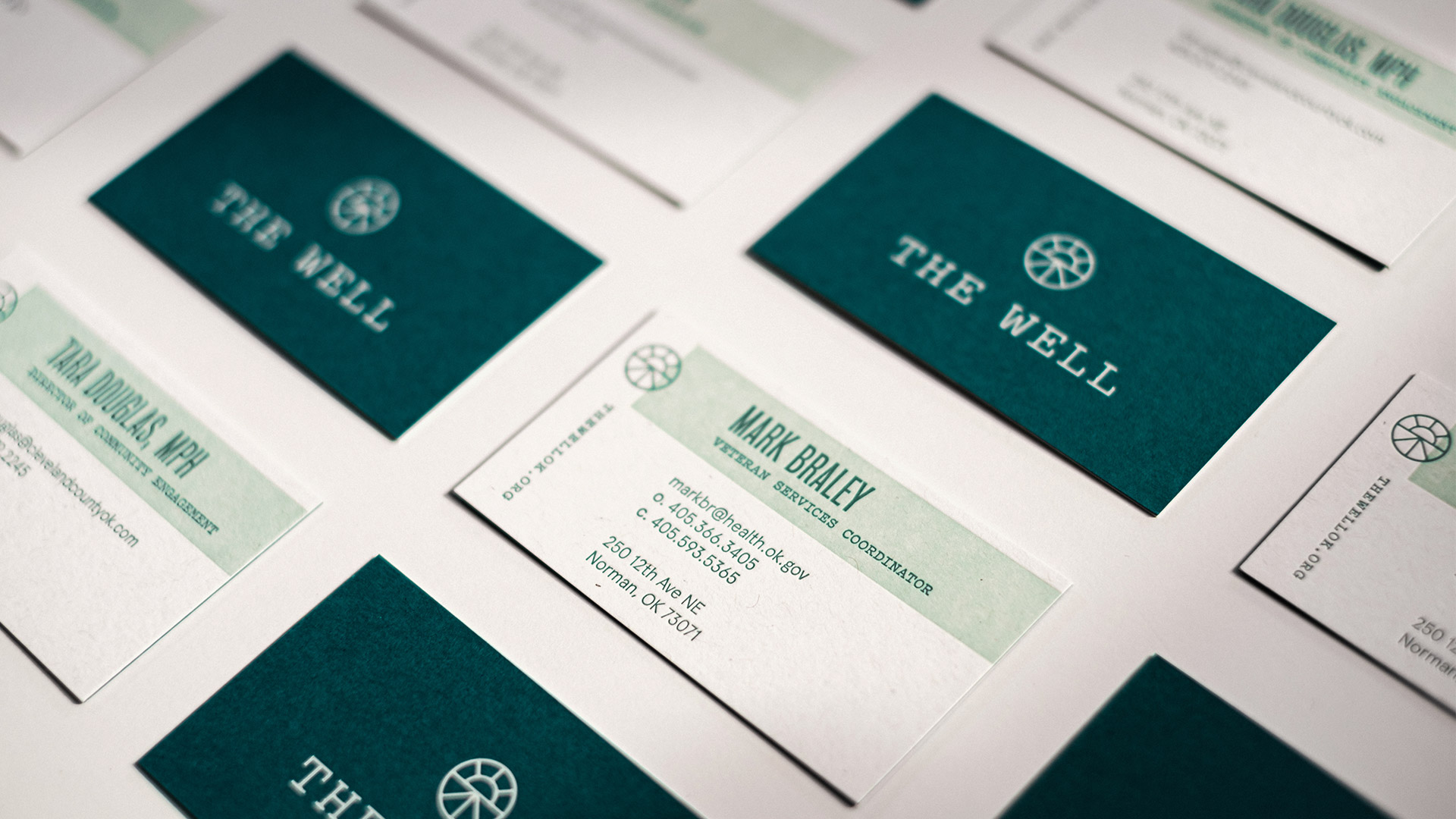
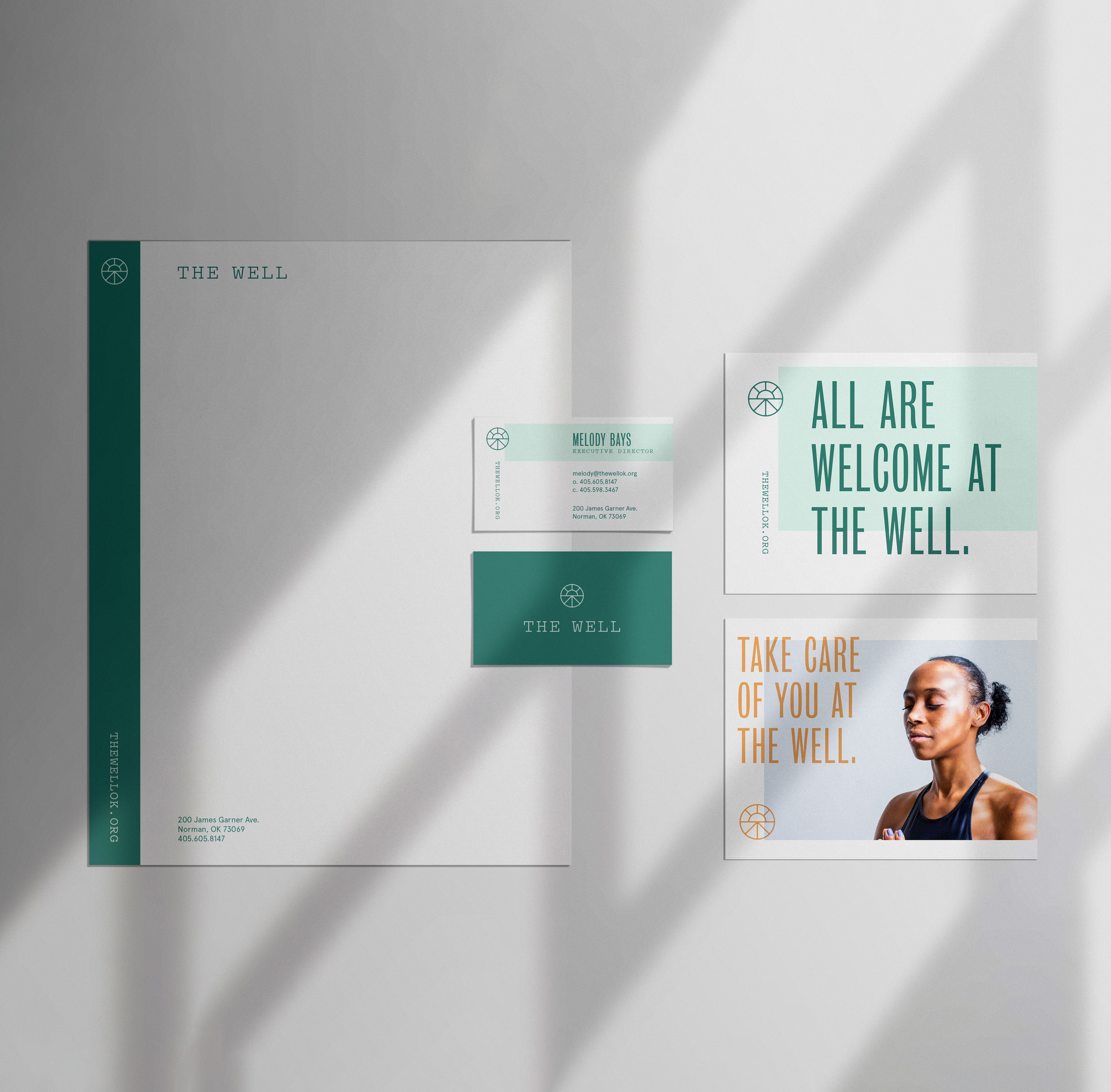
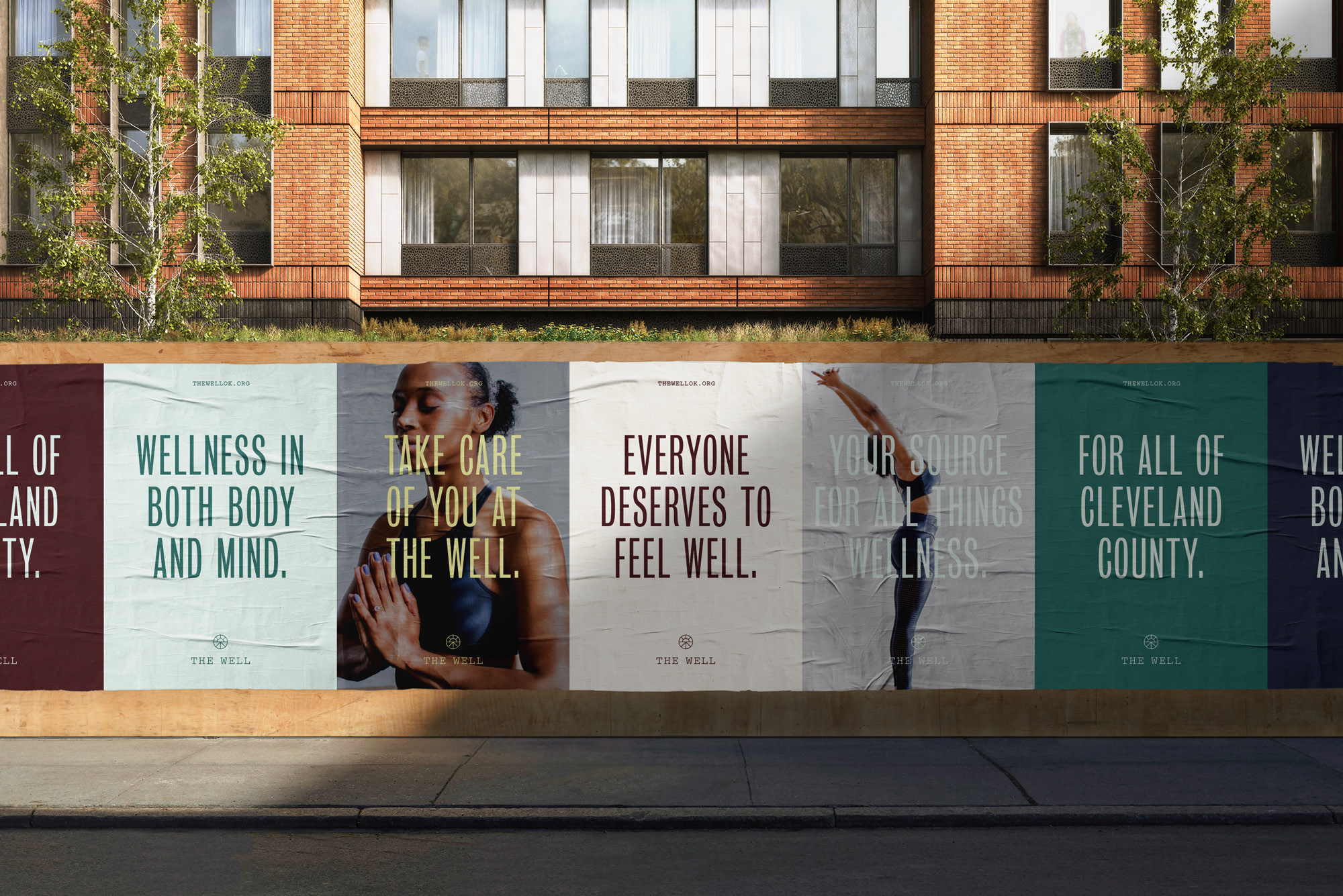
Our team at Ghost worked to create a flexible identity that felt less like a municipal brand and more like a lifestyle brand. We built an expanded color system that allowed the Farm Market brand materials to have a unique palette that still felt connected to the overall Well parent brand.
Work done at Ghost.
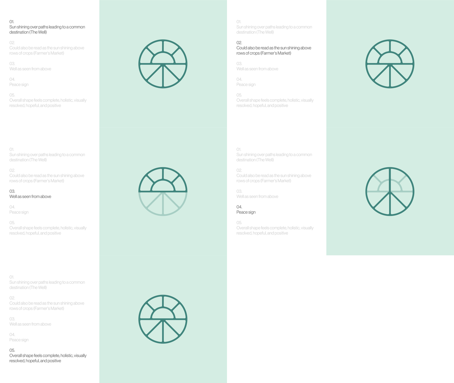
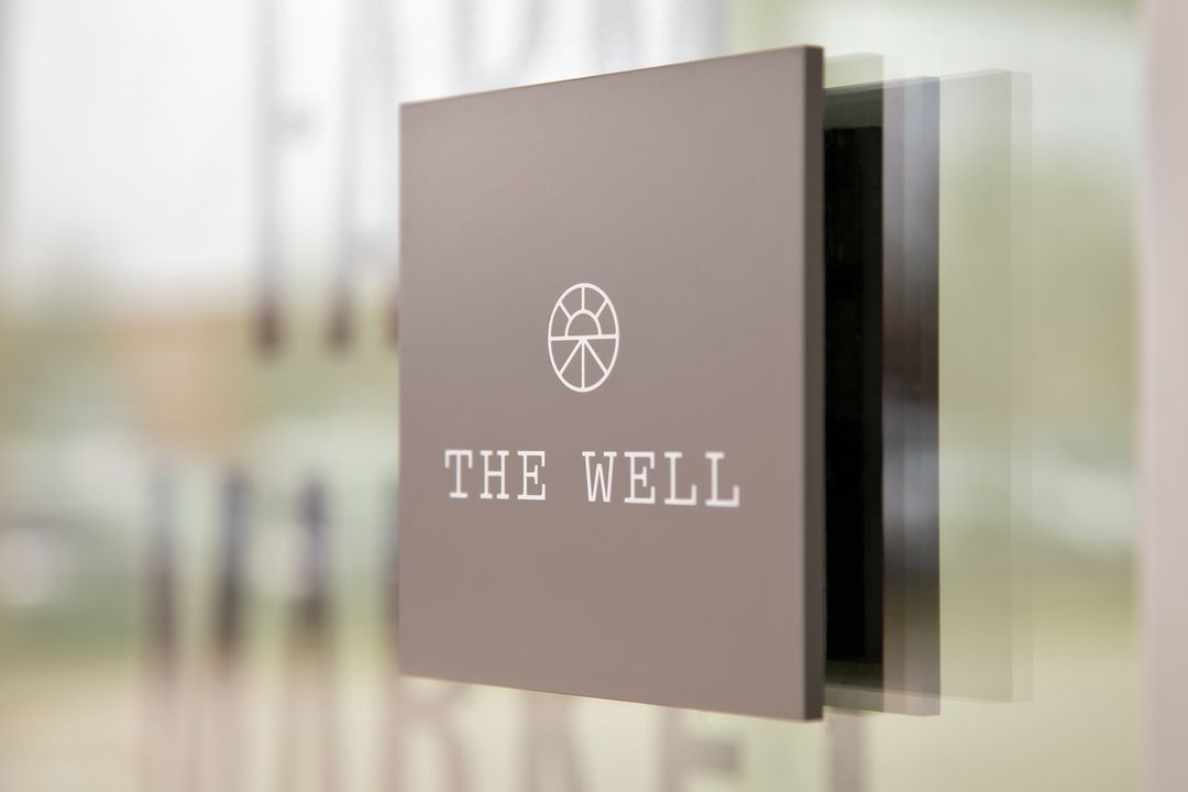
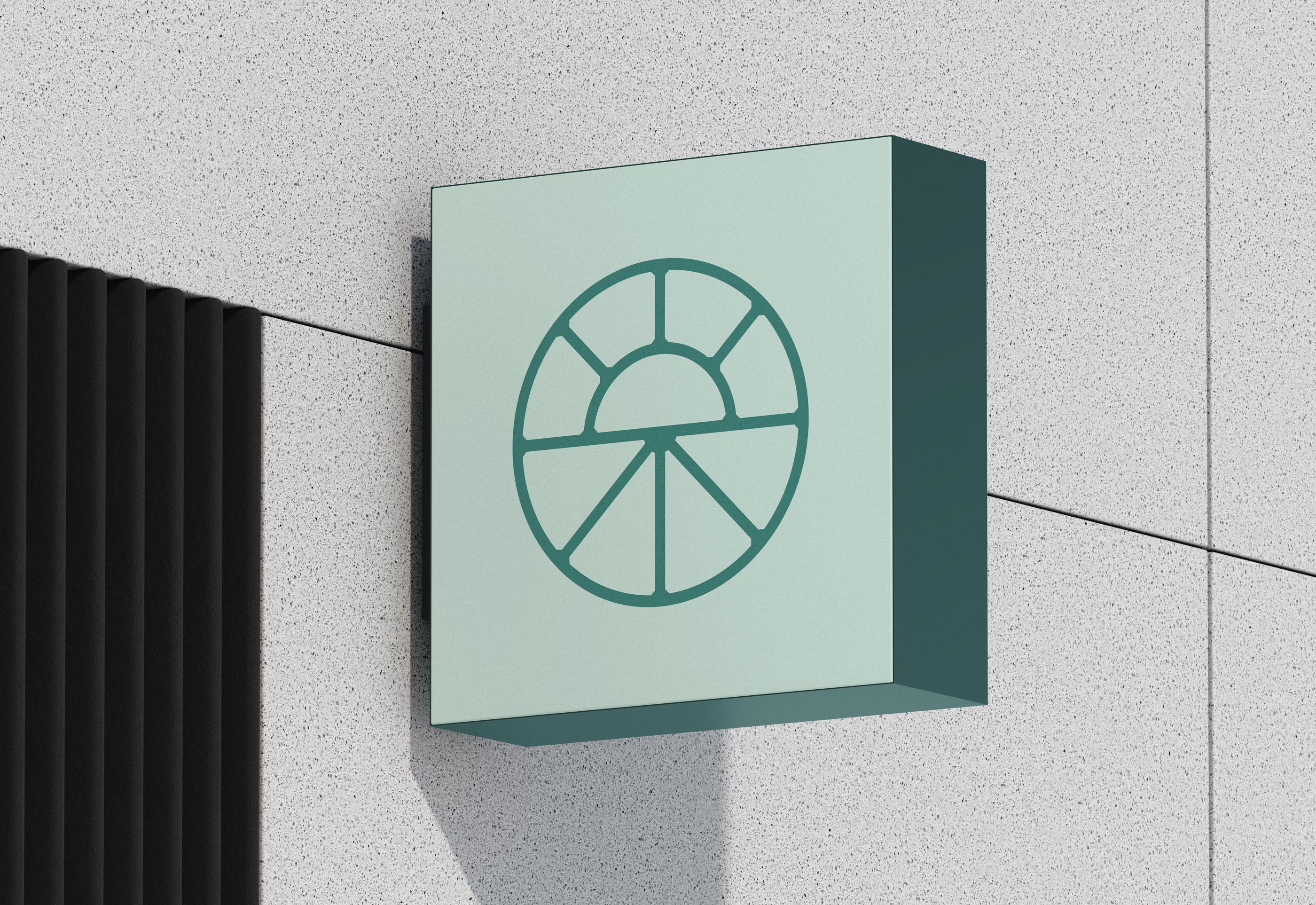
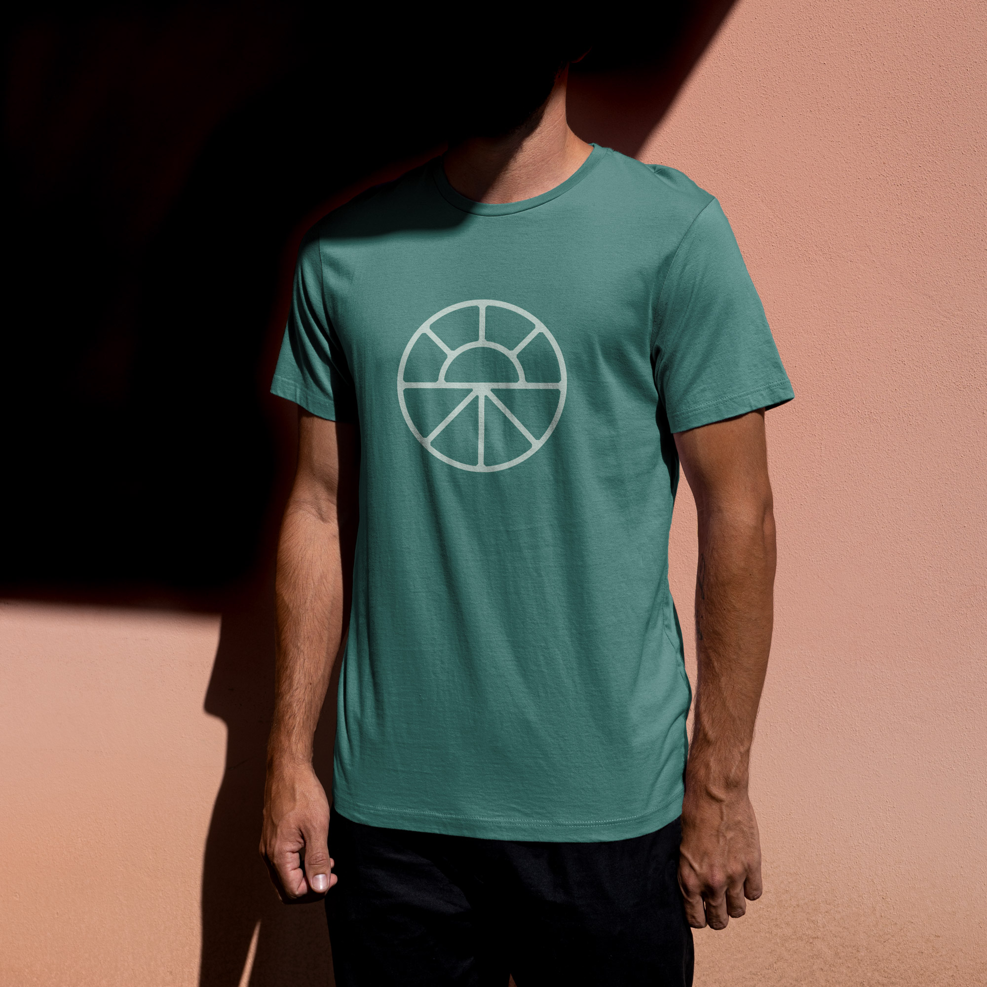
The icon for The Well is simple, geometric, and meaningful. It can be viewed as rows of crops, or as a path leading to a common destination. The overall shape feels balanced, holistic, hopeful, and resolved. It is flexible and works across the full range of sizes.





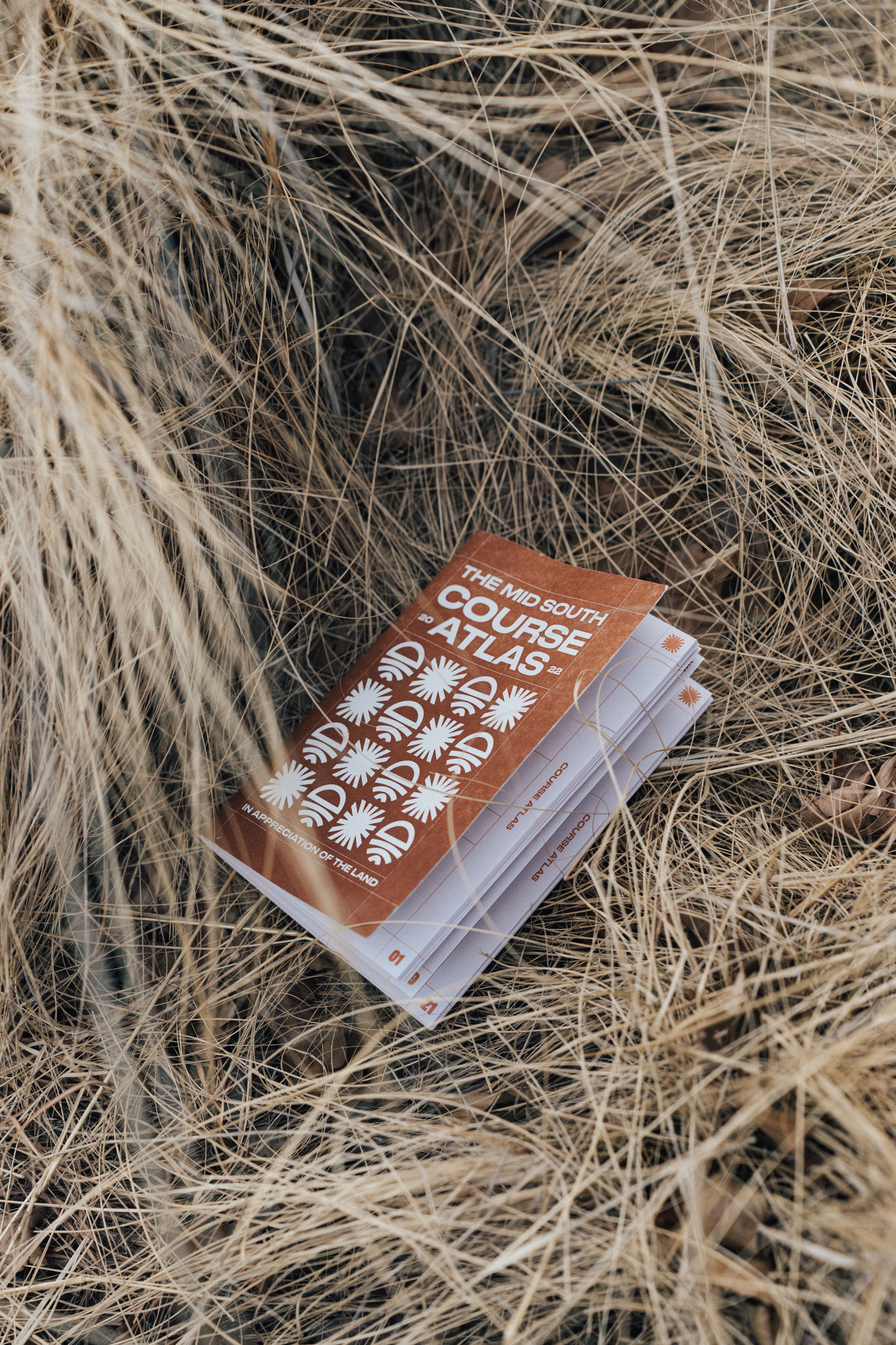
The Mid South Course Atlas
Book Design, 2022
Winner Graphex Award for Print Design
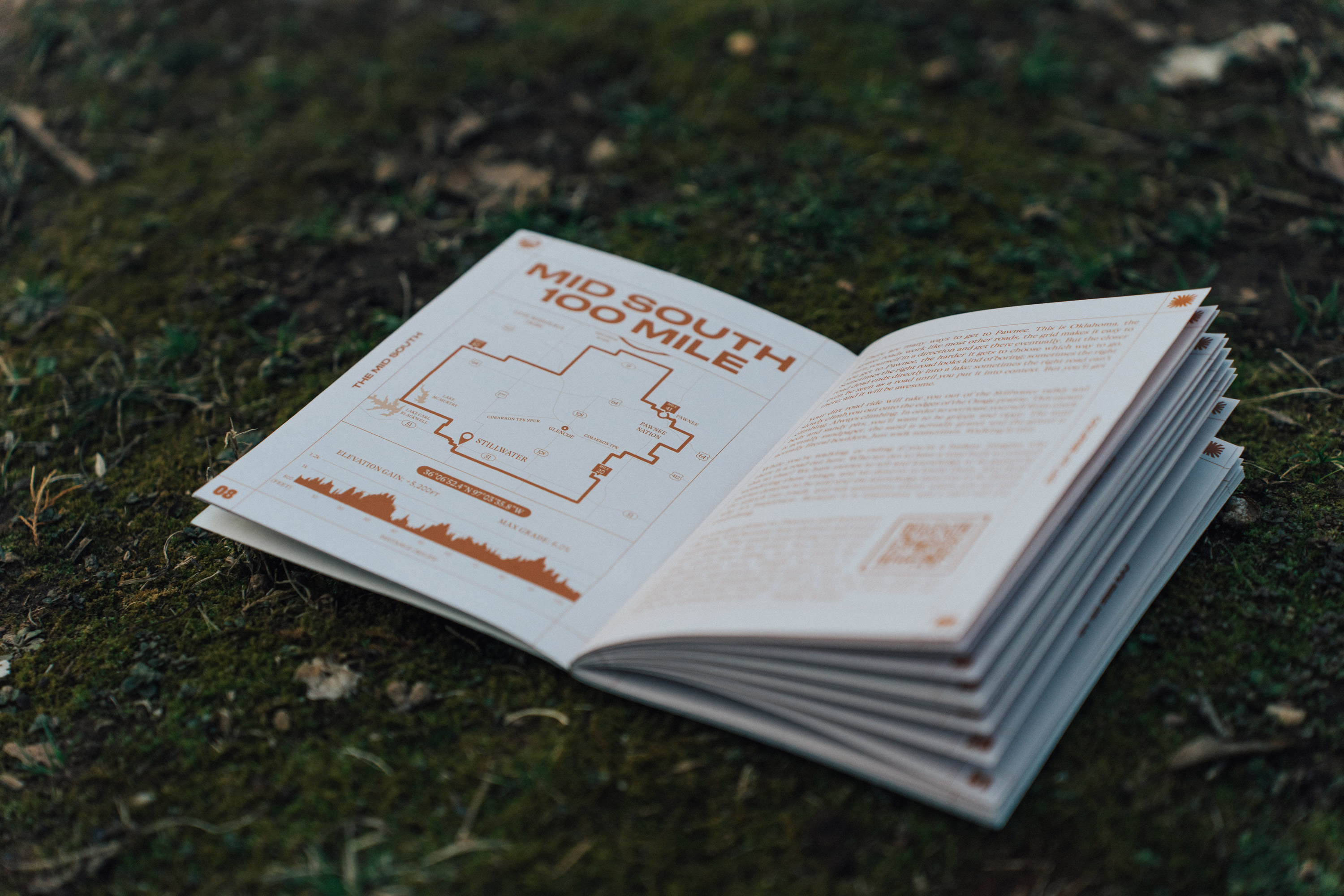
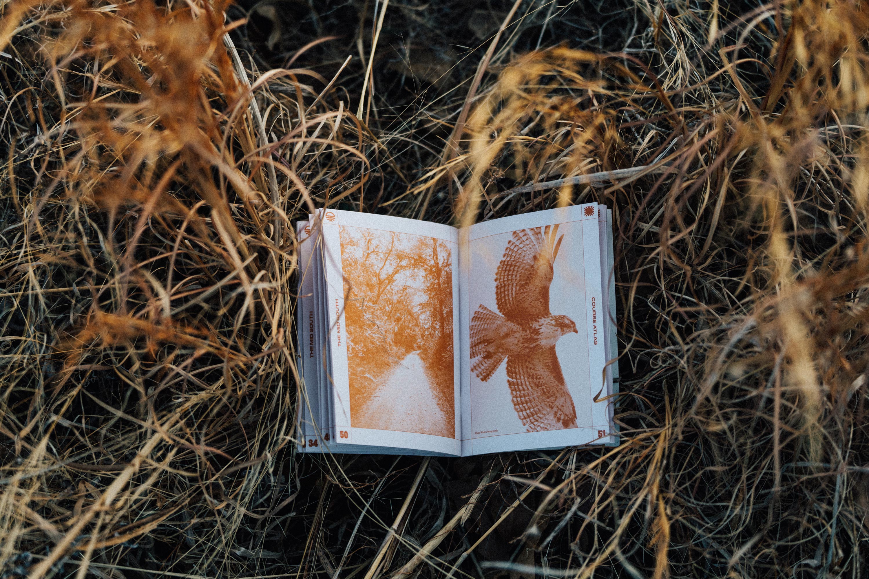
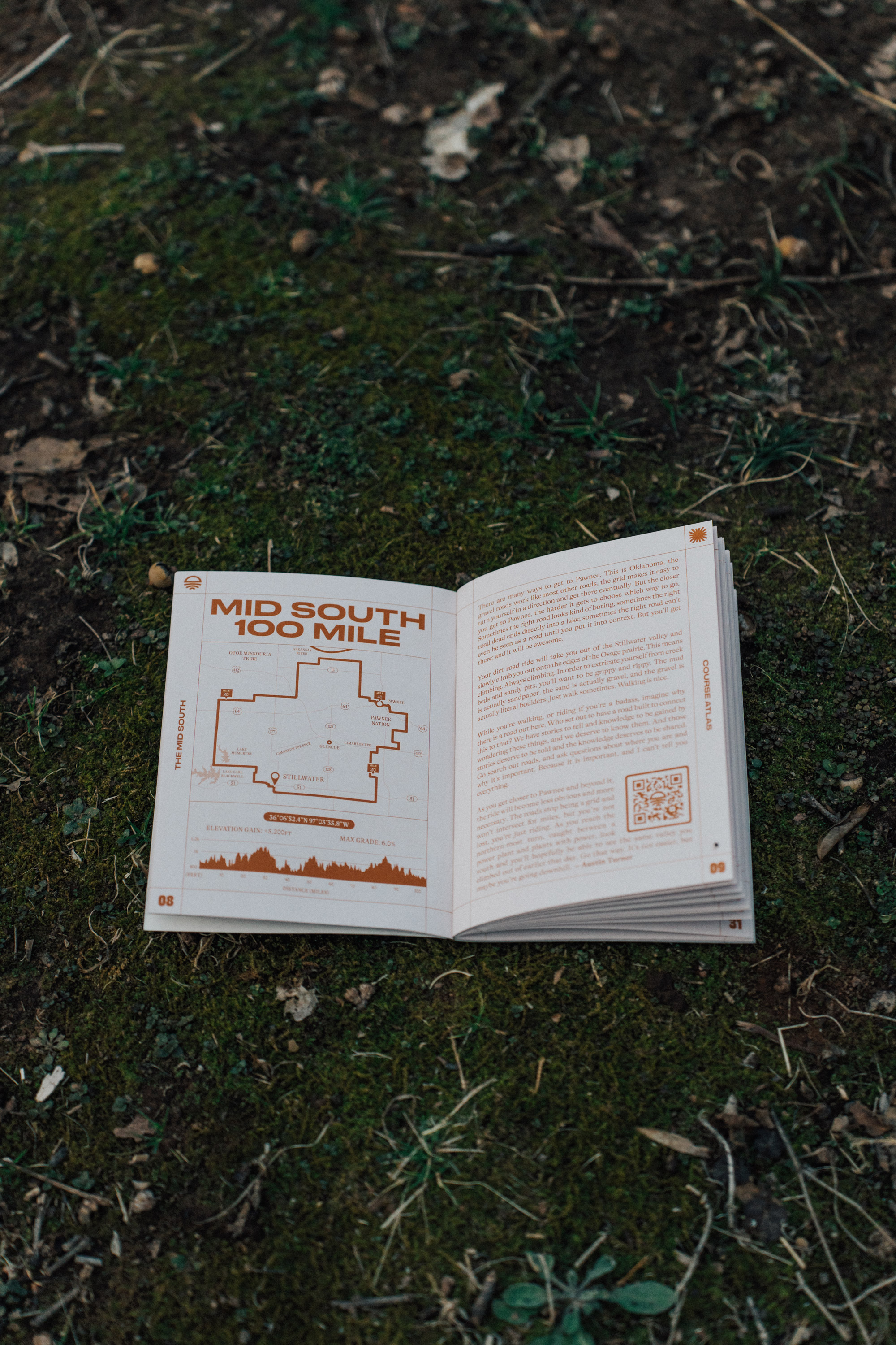
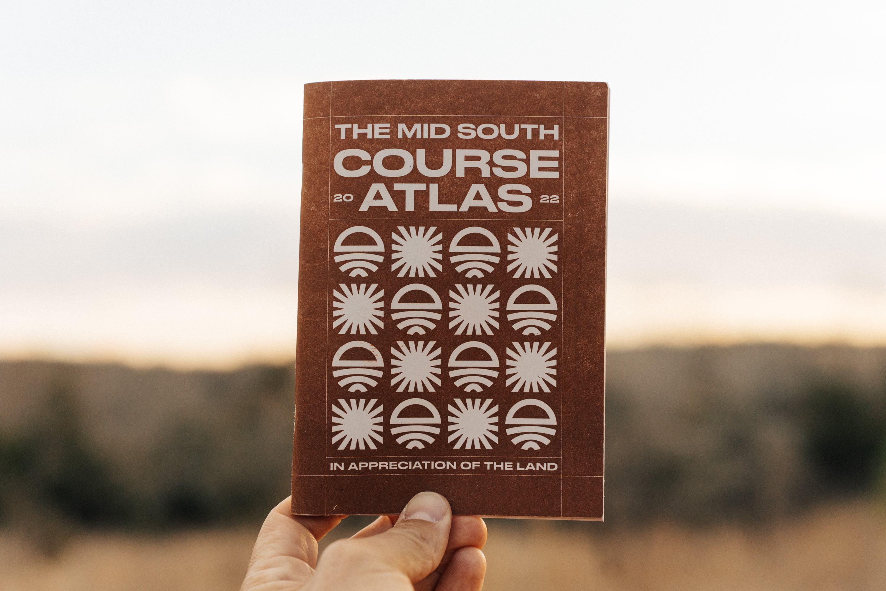
The 2022 Mid South Course Atlas is a collection of writing, art, and land gratitudes from a diverse set of friends, athletes, and thought leaders. Created to give riders and participants of the Mid South a closer look at the land they’re riding and running on, with environmental context, cultural history, and route information.
Created with support from Easton Overland
Hand built by Mordecai Book Building
Mid South logo and branding by Bryan Couchman
Photos by Josh McCullock.
Created with support from Easton Overland
Hand built by Mordecai Book Building
Mid South logo and branding by Bryan Couchman
Photos by Josh McCullock.

Working on this atlas was a dream project for me. It combined my passion for the ways we encounter and experience the land on which we live with my deep appreciation for the history of the tribes who have inhabited this land long before us and inhabit it still today. The content was provided by contributors and artists I have looked up to for a long time, so it was very exciting to engage with what they provided and strive to lay it out in a way that was both informative and beautiful.


