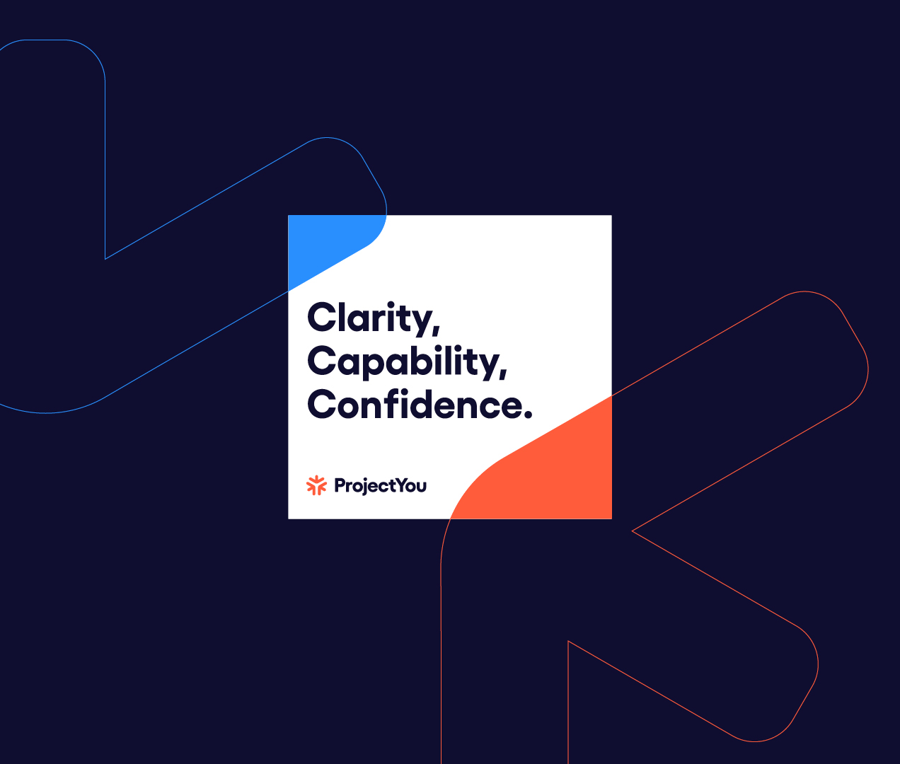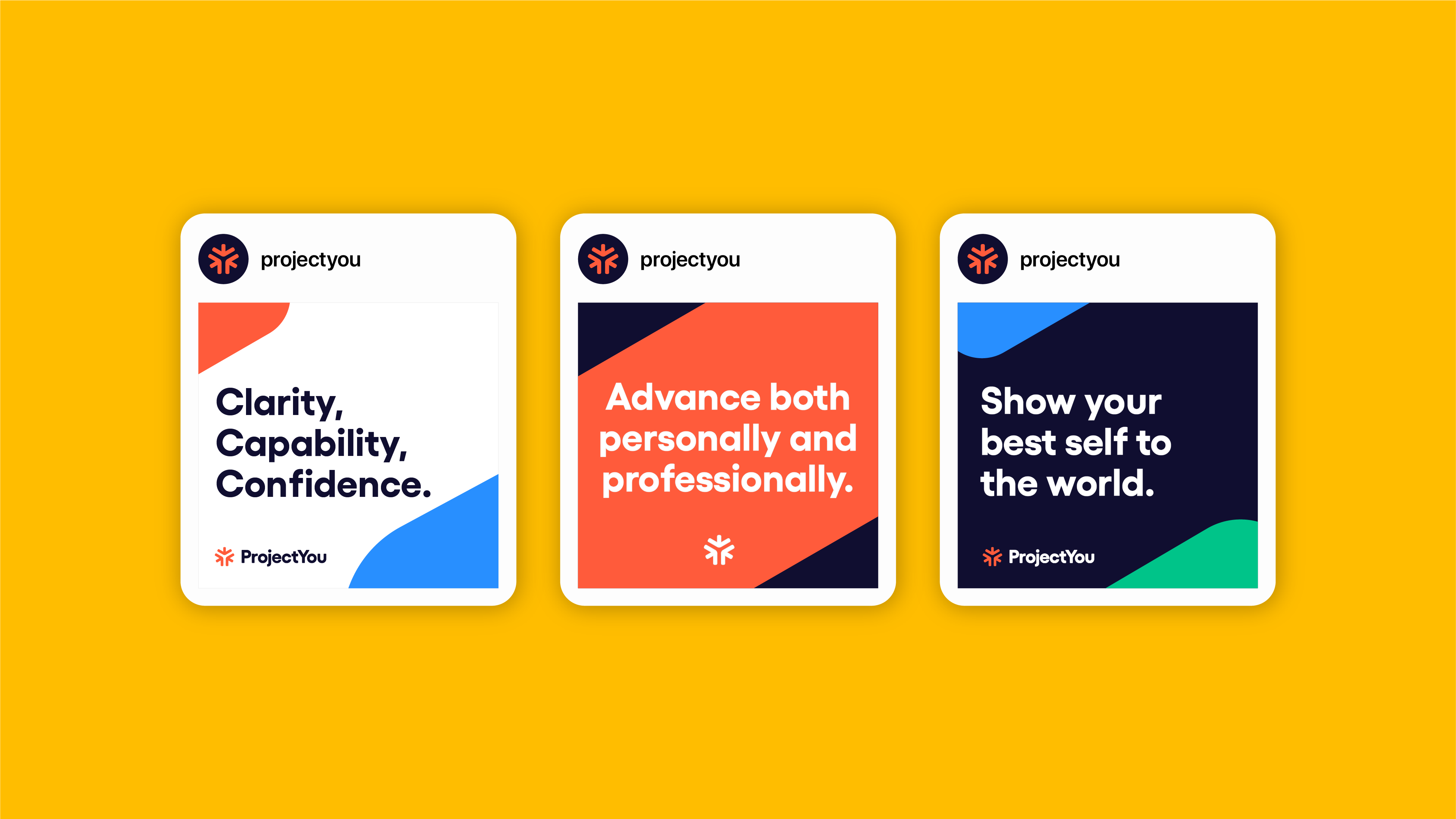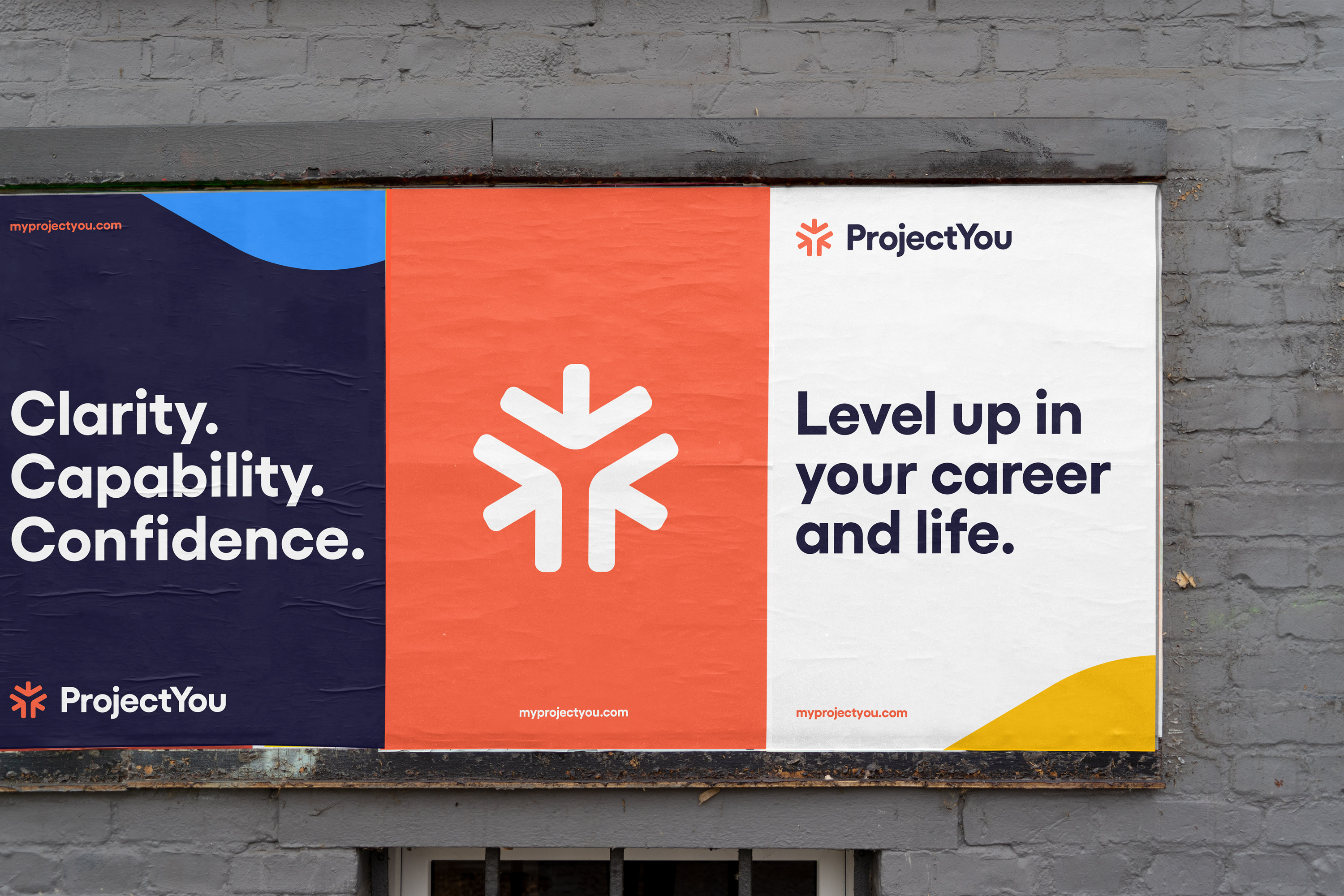
ProjectYou was developed to give emerging professionals what they need to advance in their career and life. ProjectYou helps with career planning, preparedness for interviews, networking, and developing an action plan to help users find their purpose. ProjectYou believes that emerging professionals gain a competitive career advantage when they have clarity, confidence, capabilities, and purpose.
I worked with ProjectYou on a brand refresh that enabled them to feel relevant and welcoming to a millenial and Gen-Z audience, while also feeling credible to emerging professionals.
I worked with ProjectYou on a brand refresh that enabled them to feel relevant and welcoming to a millenial and Gen-Z audience, while also feeling credible to emerging professionals.

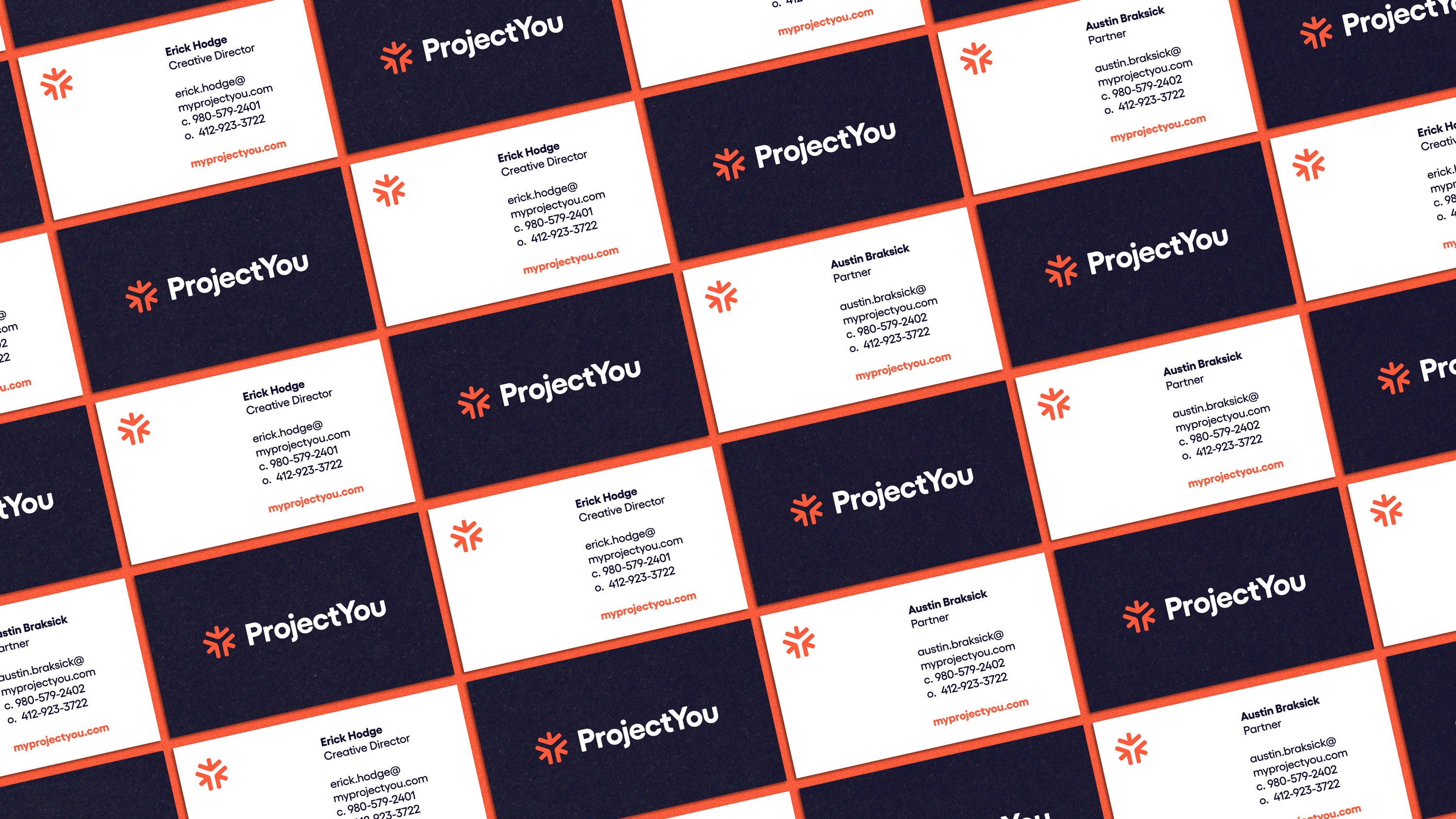
The negative space in the center of the ProjectYou icon forms a “Y”, referencing their name and their focus on self-improvement.
The positive space is comprised of arrows pointing inward, emphasizing that personal and professional development begin with development of the self.
The overall shape feels symmetrical, complete, whole, and balanced, which is a reference to the Whole You and the holistic wellness that ProjectYou helps people find.
The end result feels like an energetic spark, a reference to a person filled with purpose and confidence who is empowered to find satisfaction and fulfillment in their life.


The brand visual device is created by scaling up the arrows from the symbol and allowing them to bleed off of the side of brand applications. This creates a framing device that unifies the brand communications and feels consistent with the other brand identity elements.