MyNextSeason partners with companies to ensure that strategically important career transitions happen well. Transitional seasons can often be filled with
doubt, uncertainty, and anxiety. MyNextSeason
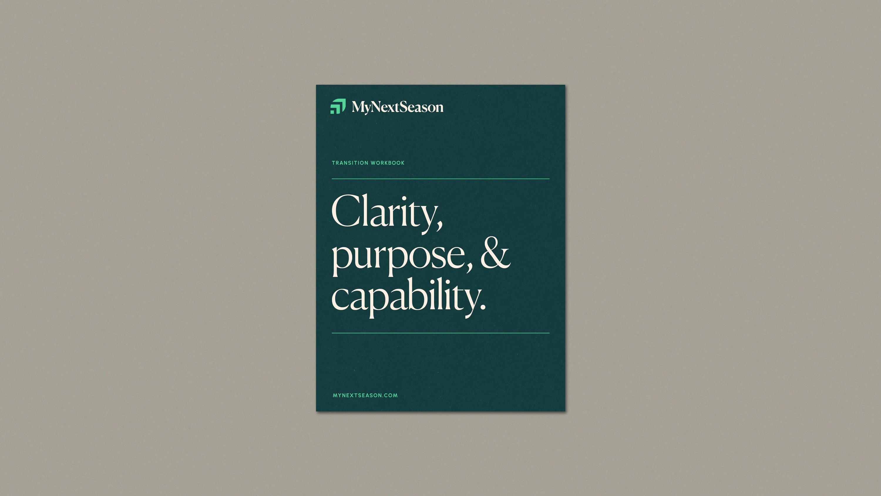
enables those individuals to find clarity, purpose,
and enhanced capability through those transitions.
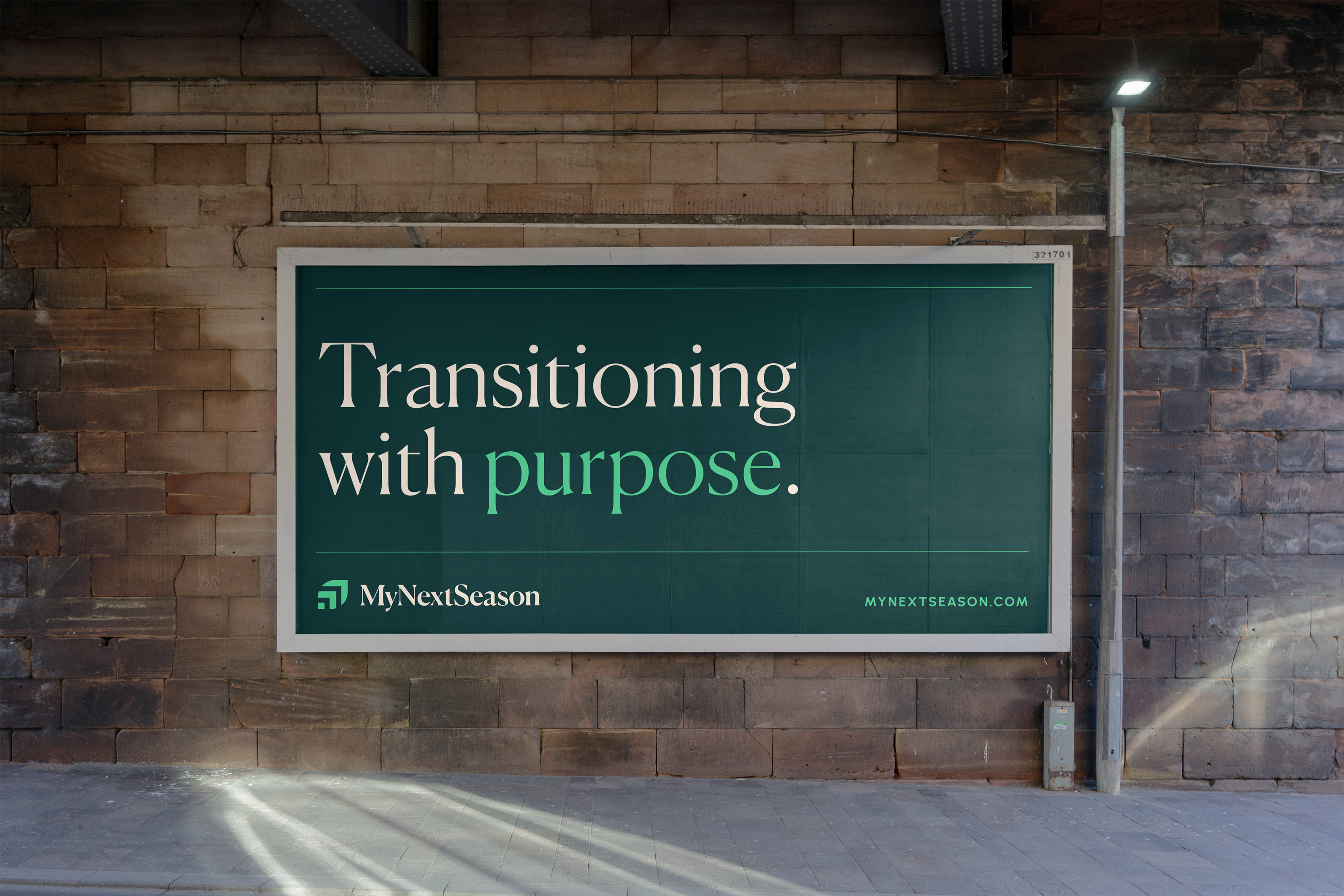
Because of the need to instill confidence in companies helping their workers during transitions, it was clear that this brand needed to be approachable, credible and positive. It needed to convey that the transitional season could actually lead to something better and could be a time filled with anticipation rather than anxiety.
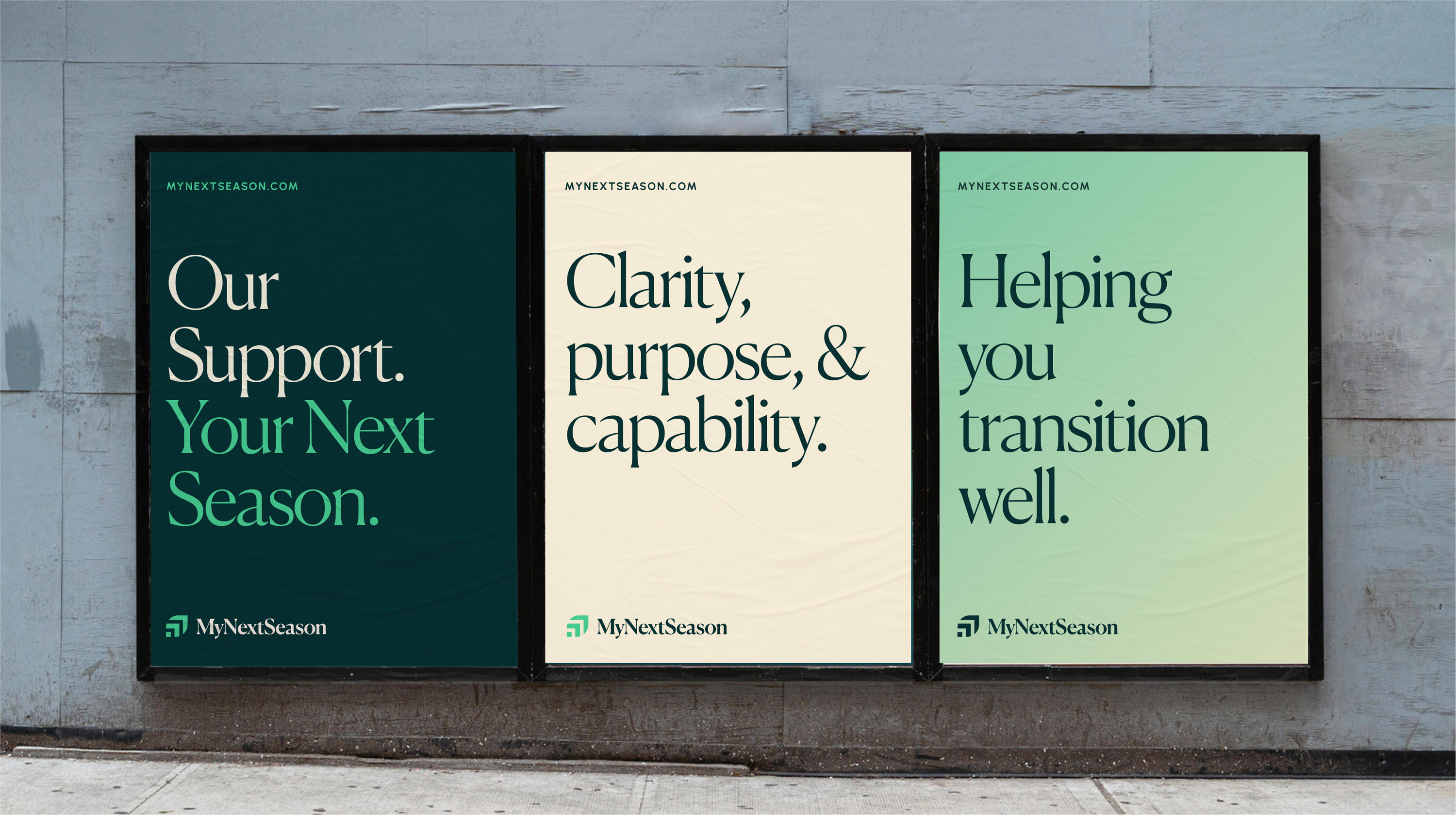
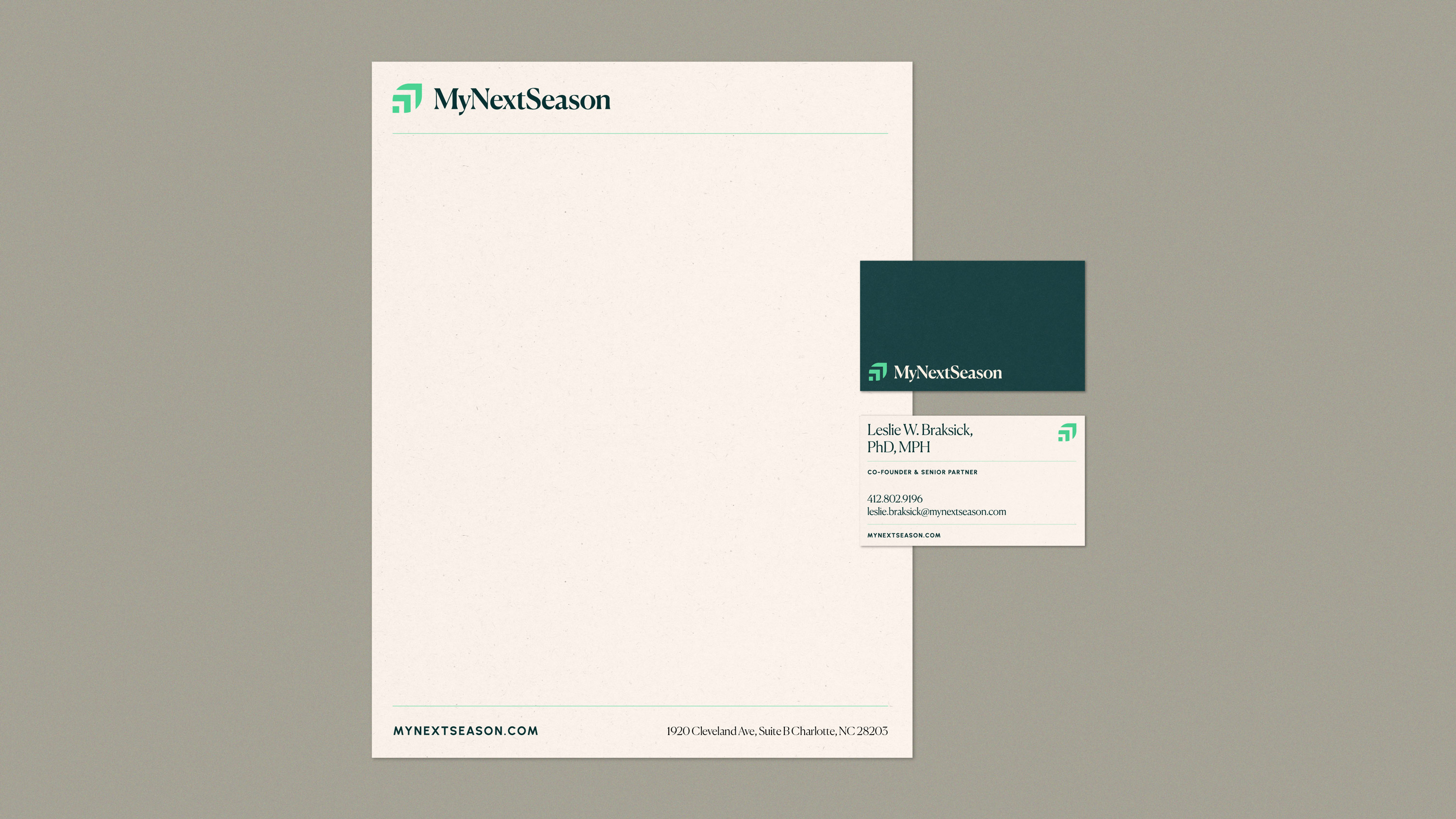
The brand identity is built around a color palette that references nature, and a serif headline typeface that feels elevated and refined.
Because of the need to instill confidence in companies helping their workers during transitions, it was clear that this brand needed to be approachable, credible and positive. It needed to convey that the transitional season could actually lead to something better and could be a time filled with anticipation rather than anxiety.
The brand identity is built around a color palette that references nature, and a serif headline typeface that feels elevated and refined.

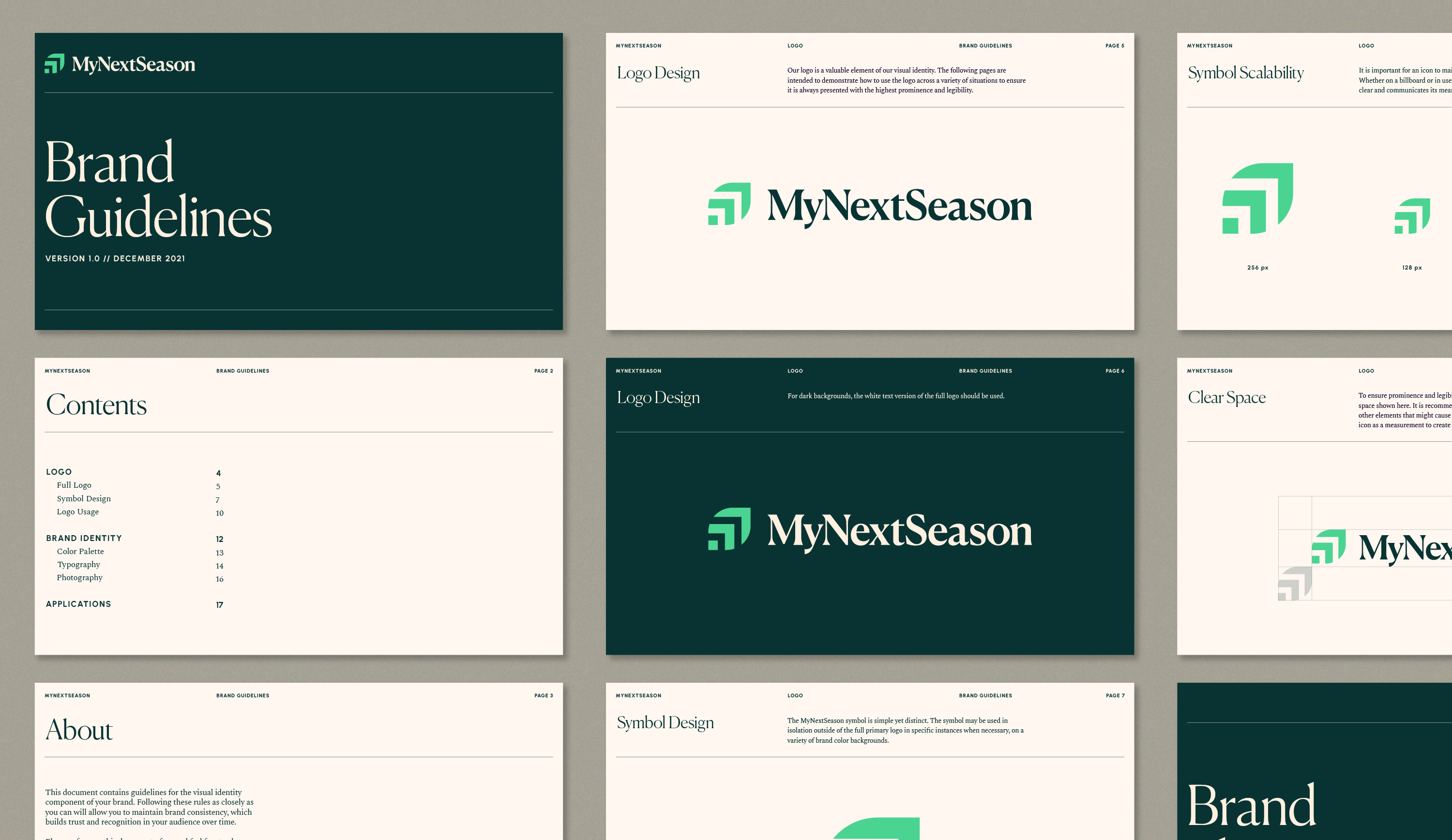
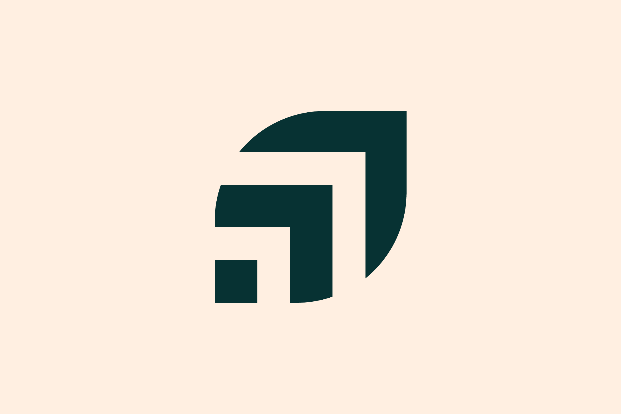
The MyNextSeason symbol is a leaf
comprised of bold lines indicating an
upward trajectory. This simple visual is
able to convey the notion of seasonality
with the overall leaf shape as well as
growth, movement, and transition through
the arrow forms. By indicating a forward and upward motion, it communicates that the transition will be positive and
hopeful.

Before/After