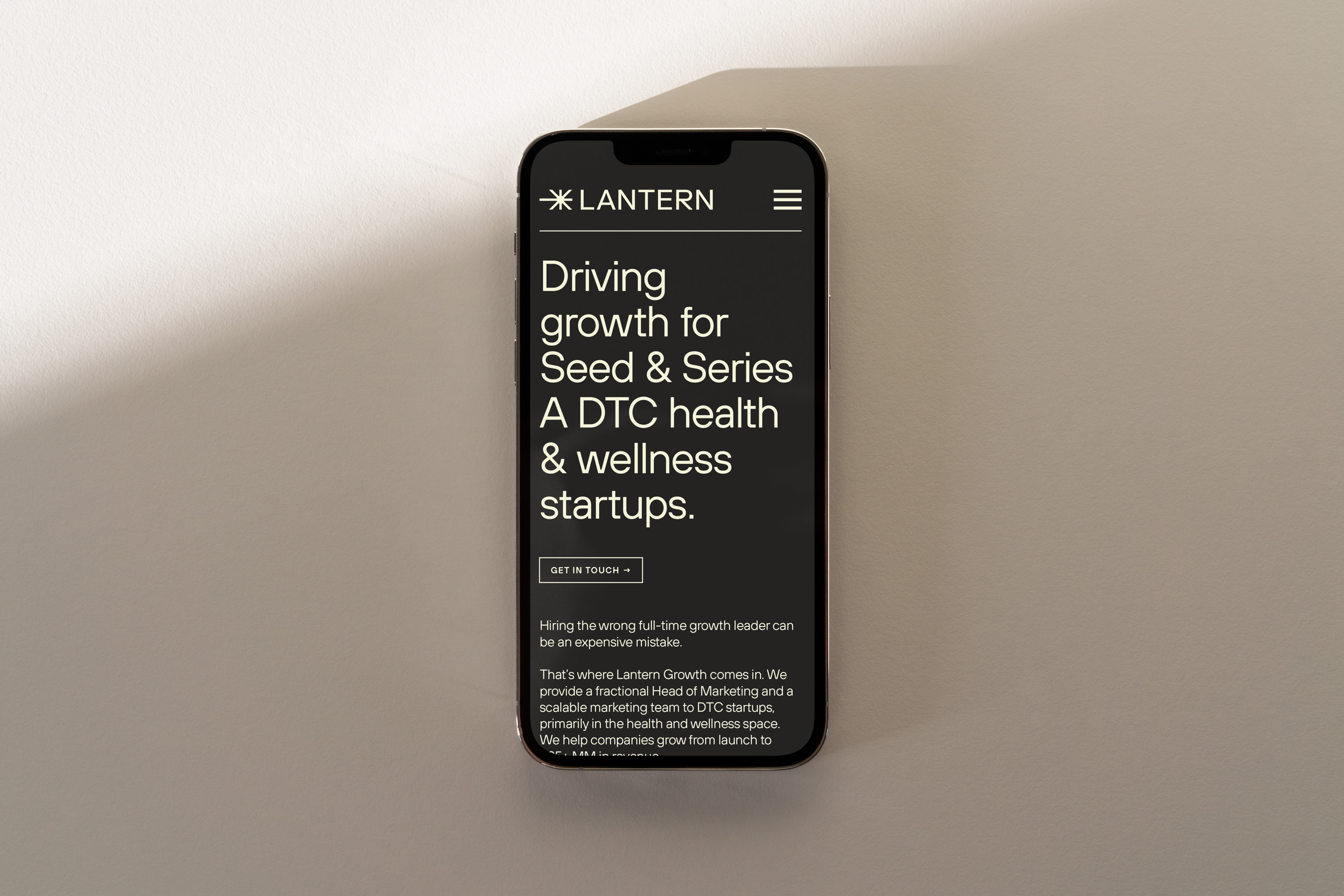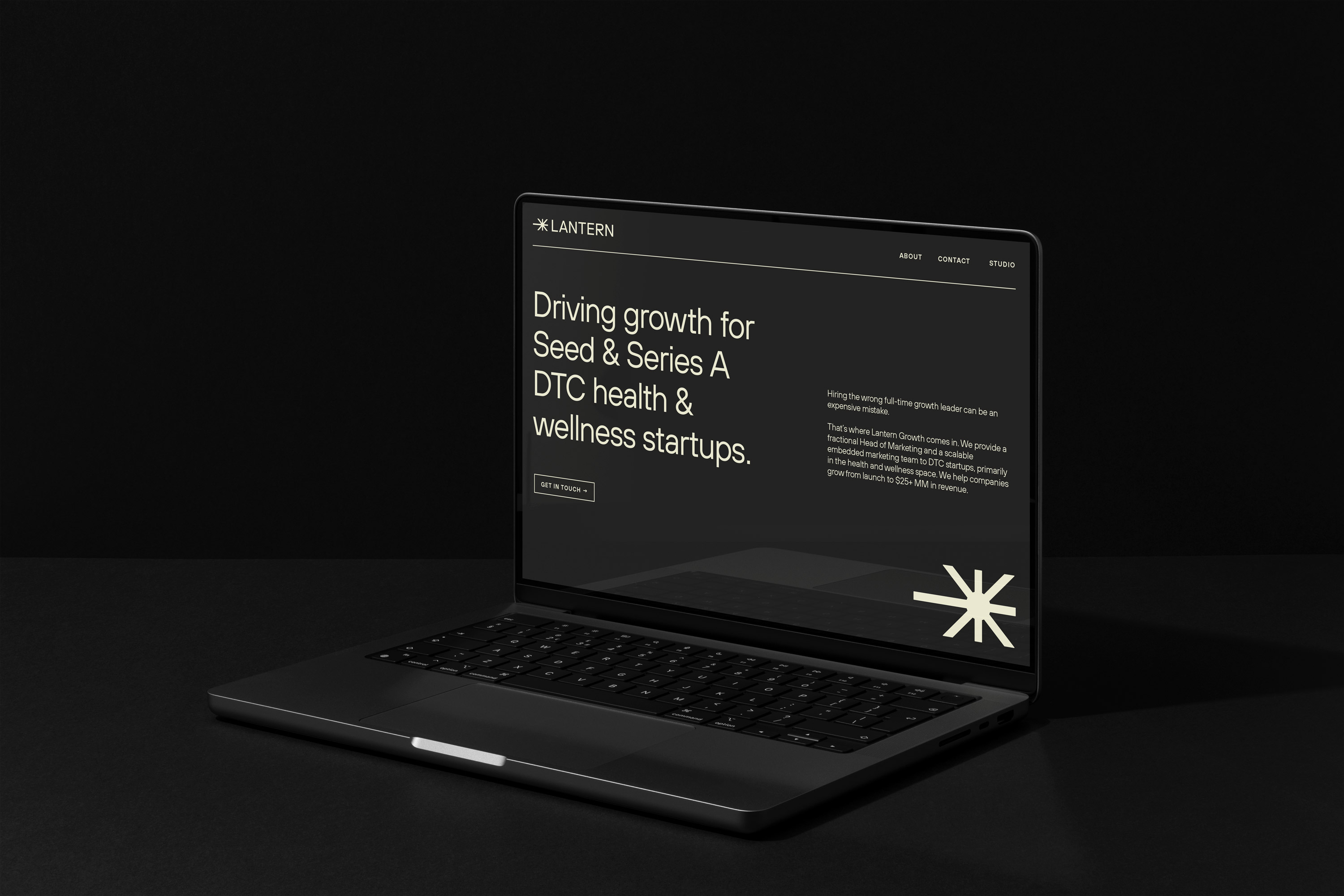
Lantern provides a fractional Head of Marketing and a scalable embedded marketing team to DTC startups, primarily in the health and wellness space. They help Seed and Series A startups grow from launch to $25+ MM in revenue.
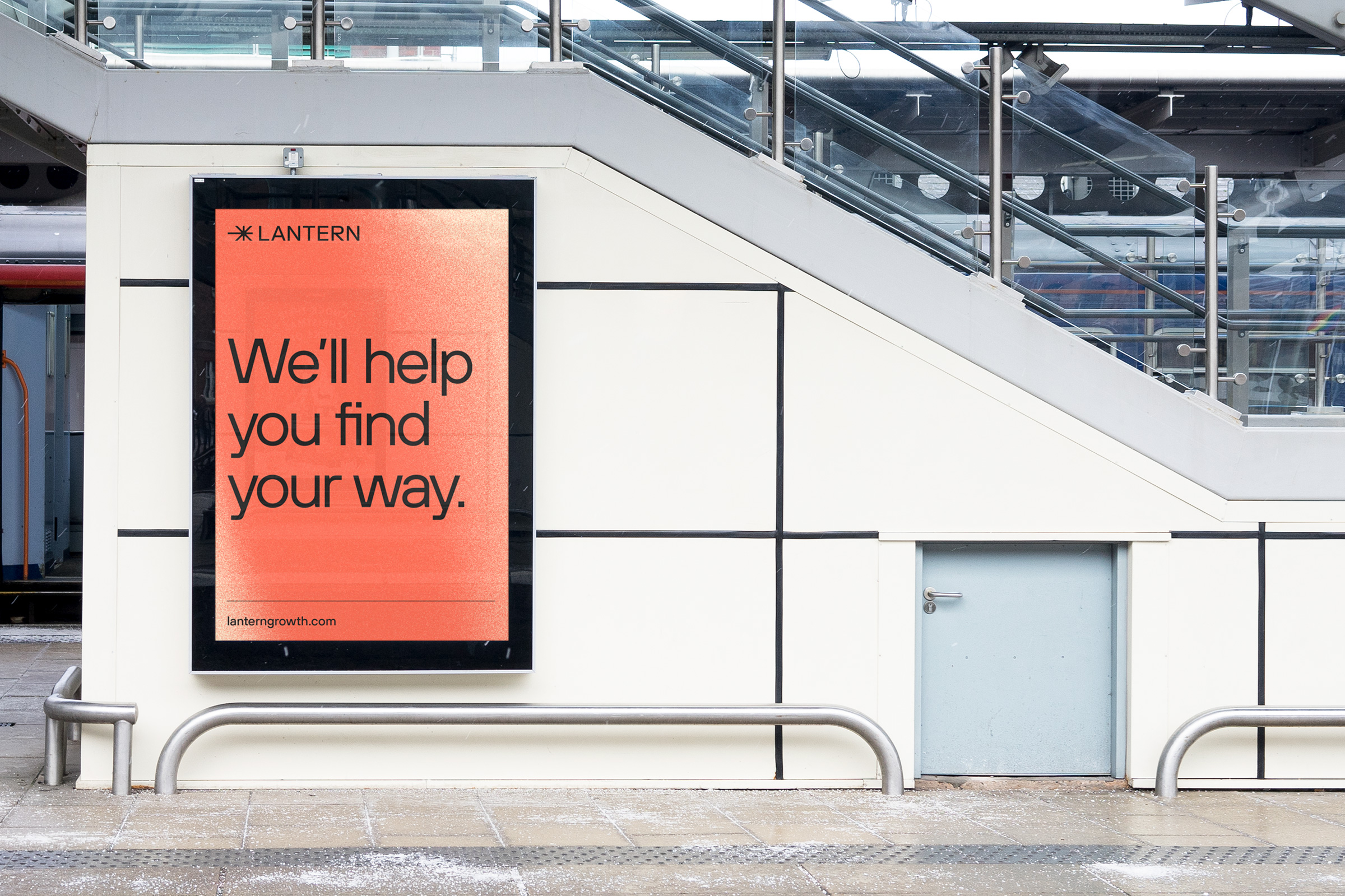
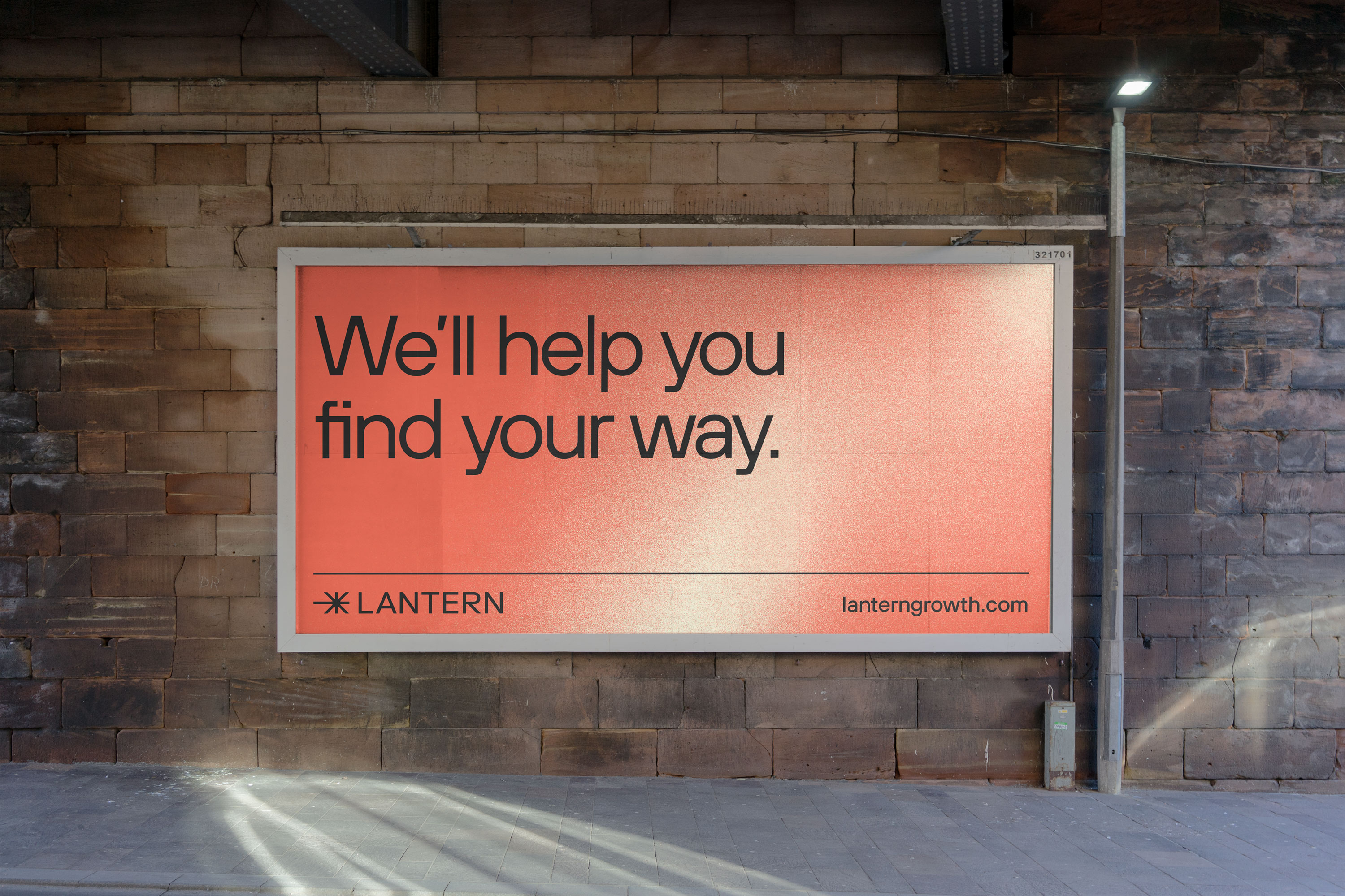
At it’s core, Lantern is full service and needed a brand identity that would allow it to be taken seriously by major companies who might be looking for a fractional Head of Marketing. I worked with Lantern to create an energized identity that references light and illumination without being too on-the-nose.
At it’s core, Lantern is full service and needed a brand identity that would allow it to be taken seriously by major companies who might be looking for a fractional Head of Marketing. I worked with Lantern to create an energized identity that references light and illumination without being too on-the-nose.

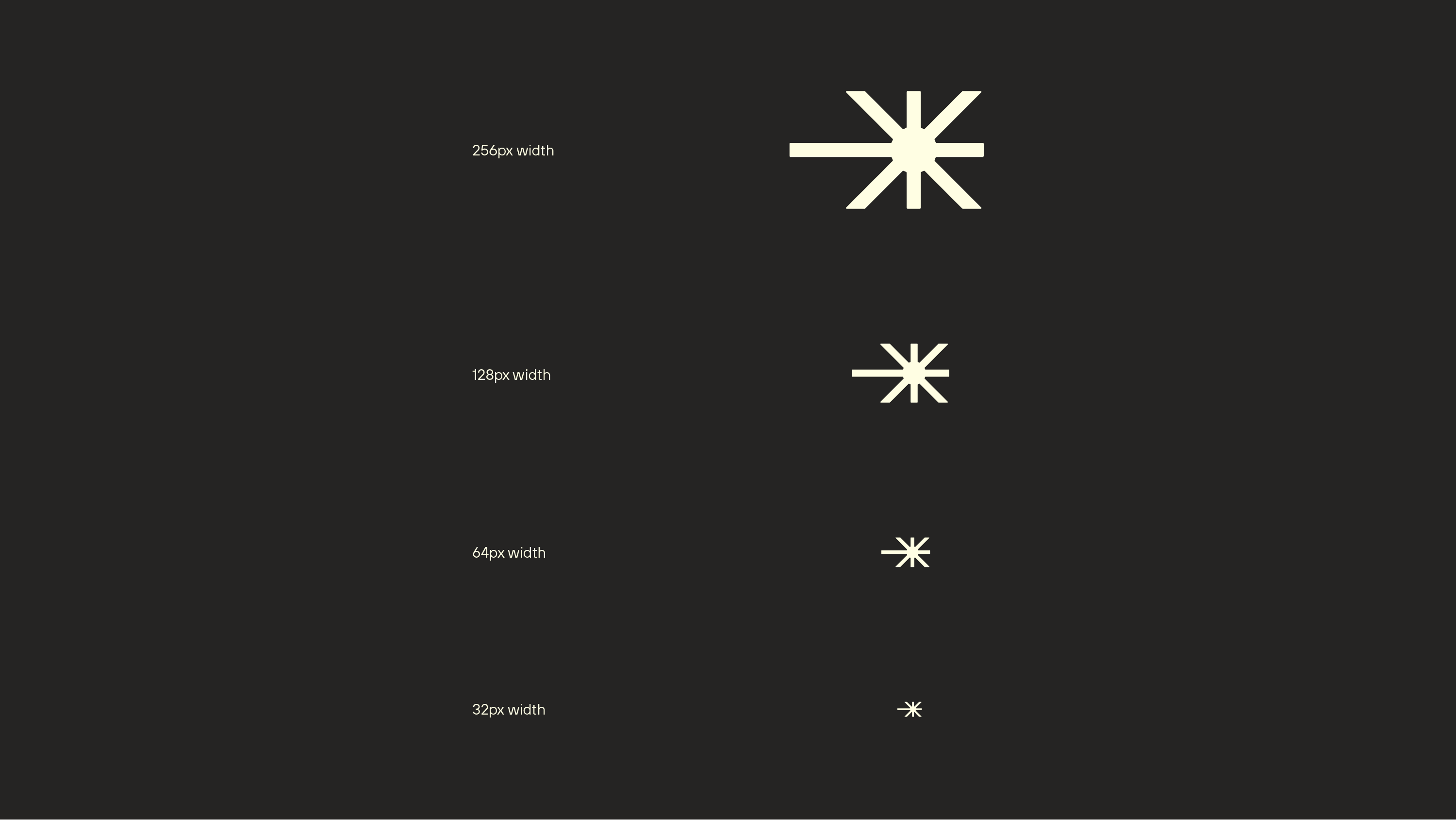
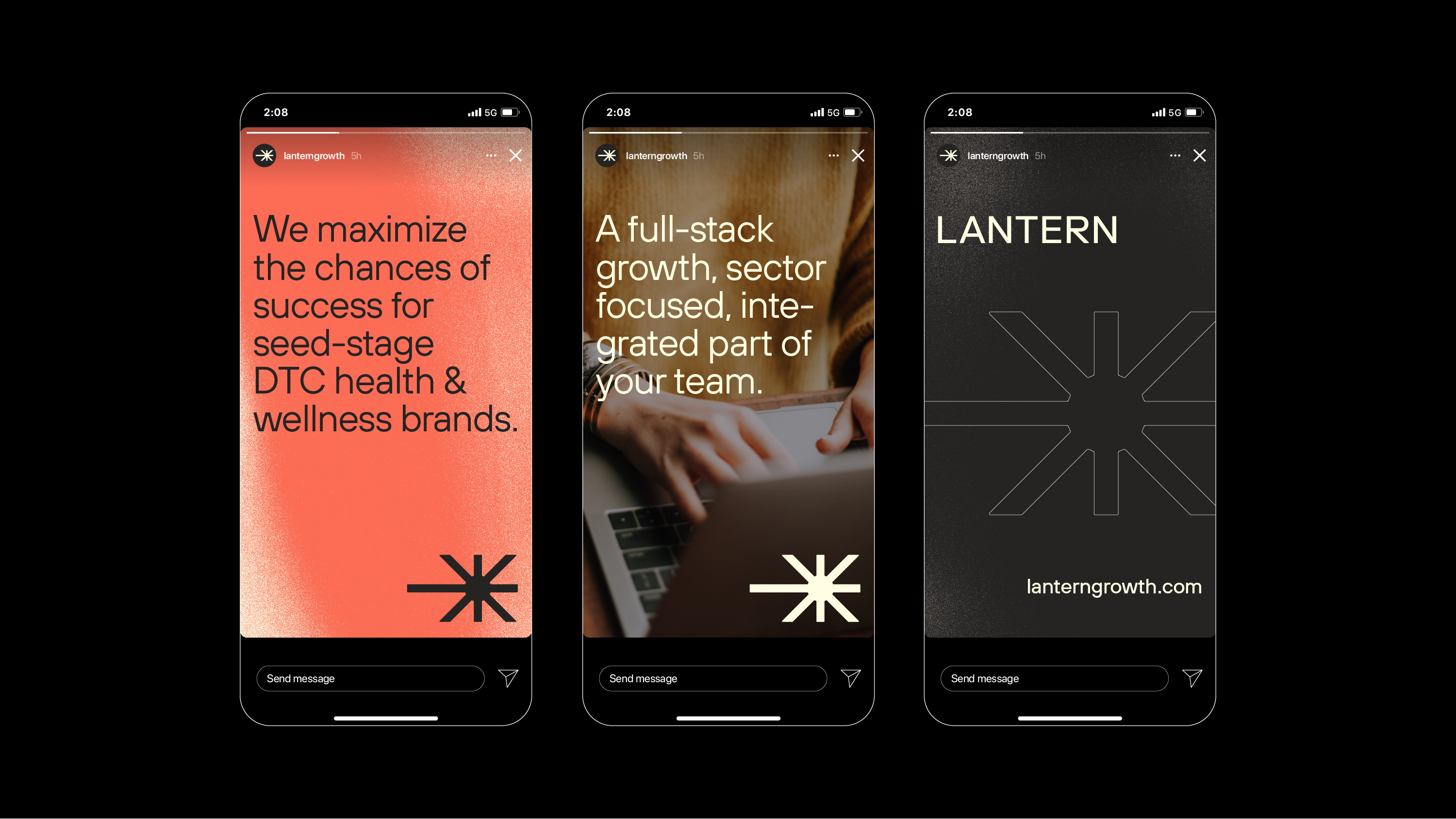
The Lantern icon features an offset light
burst radiating out from the center. Because the source of light is focused slightly to the
right, it gives the sense that it is moving
forward, leading the way toward growth.
The offset also emphasizes the left arrow
shape pointing forward, which
gives the overall composition momentum
and energy. The lines all bursting out
from the center also provide an abstract
reference to a lantern.
The icon pairs well with the type mark,
having consistent widths with the
letterforms as well as matching the
overall height. All of the corners of the
icon and type are also slightly rounded,
helping the whole composition feel
cohesive and unified.

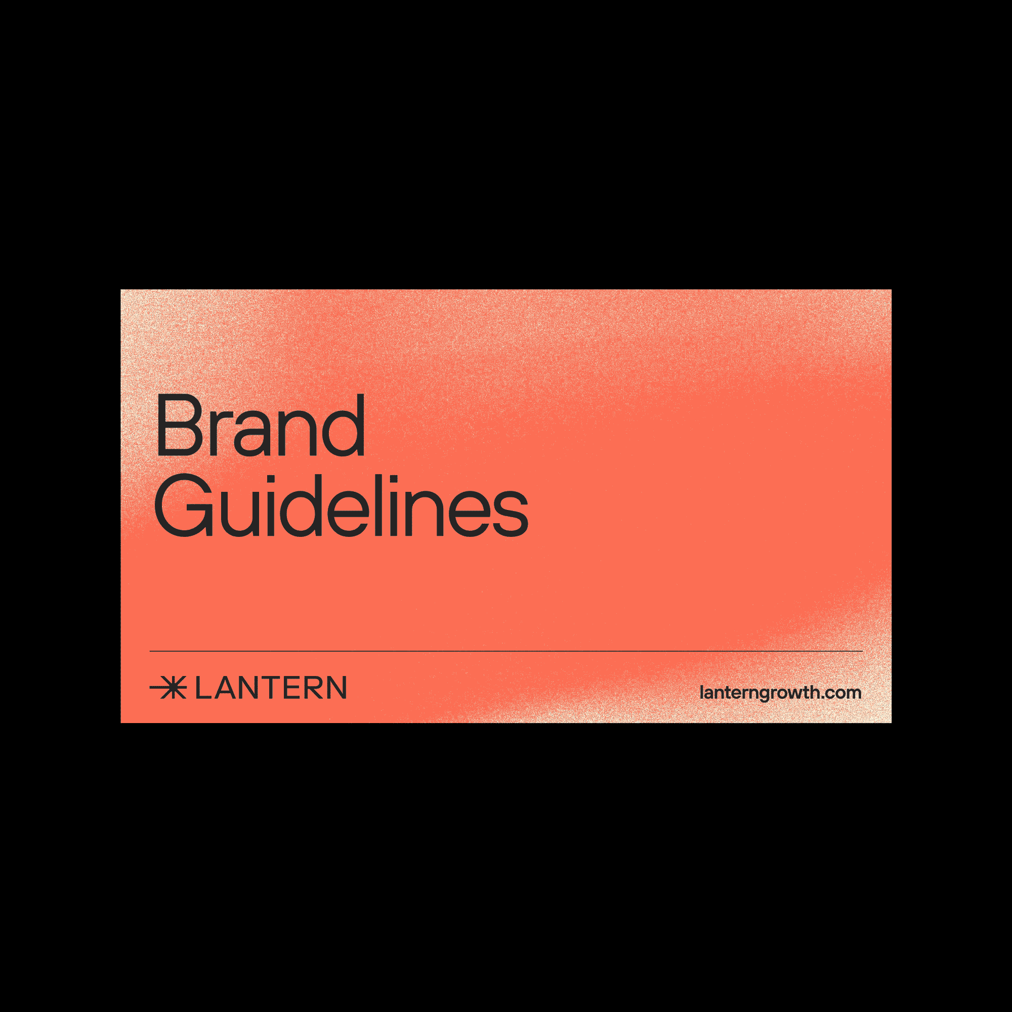
Brand Guidelines