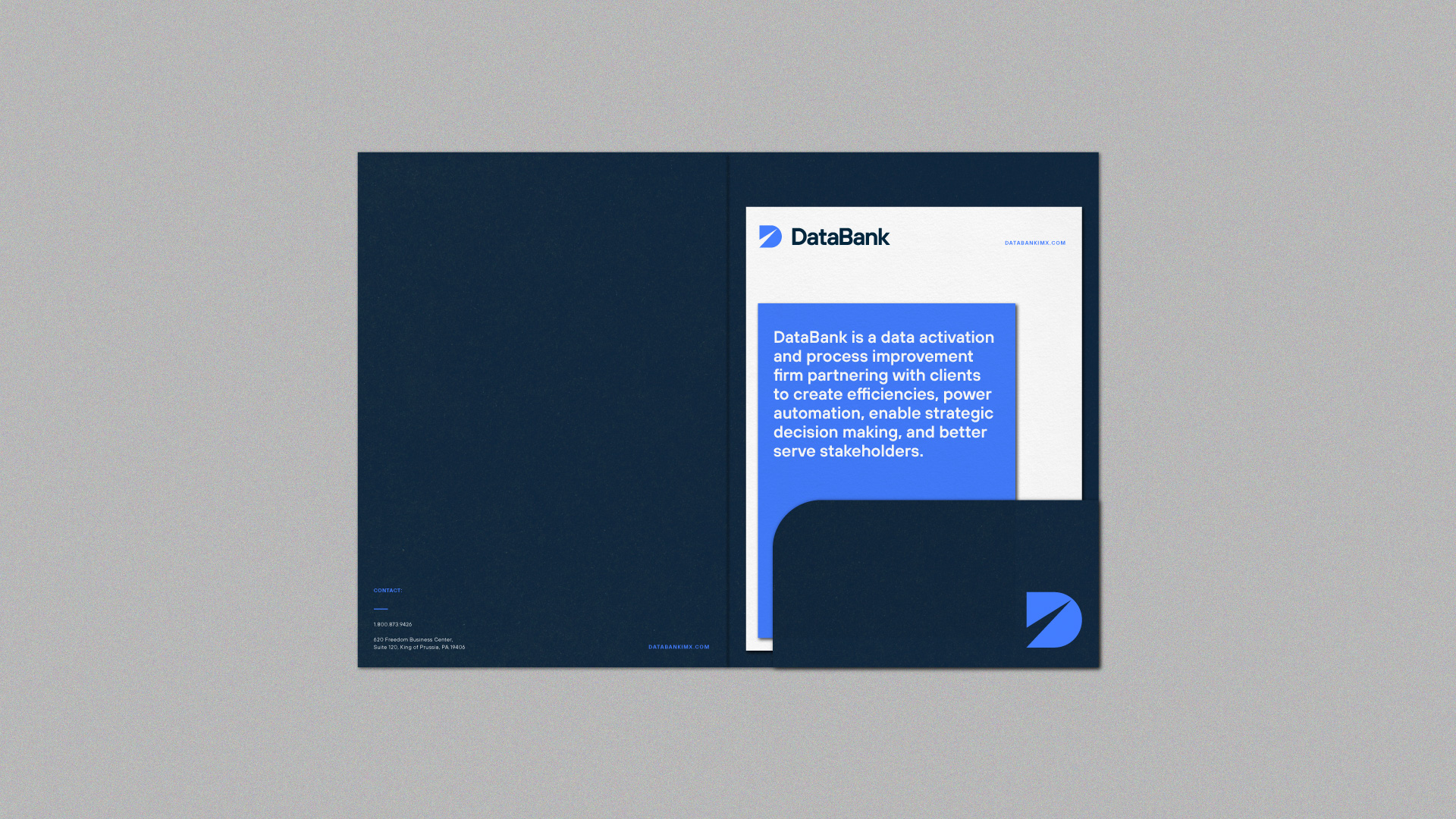
DataBank, a Kyocera Group Company, is a data activation and process improvement firm partnering with government, healthcare, and private sector clients to create efficiencies, power automation, and enable strategic decision making.
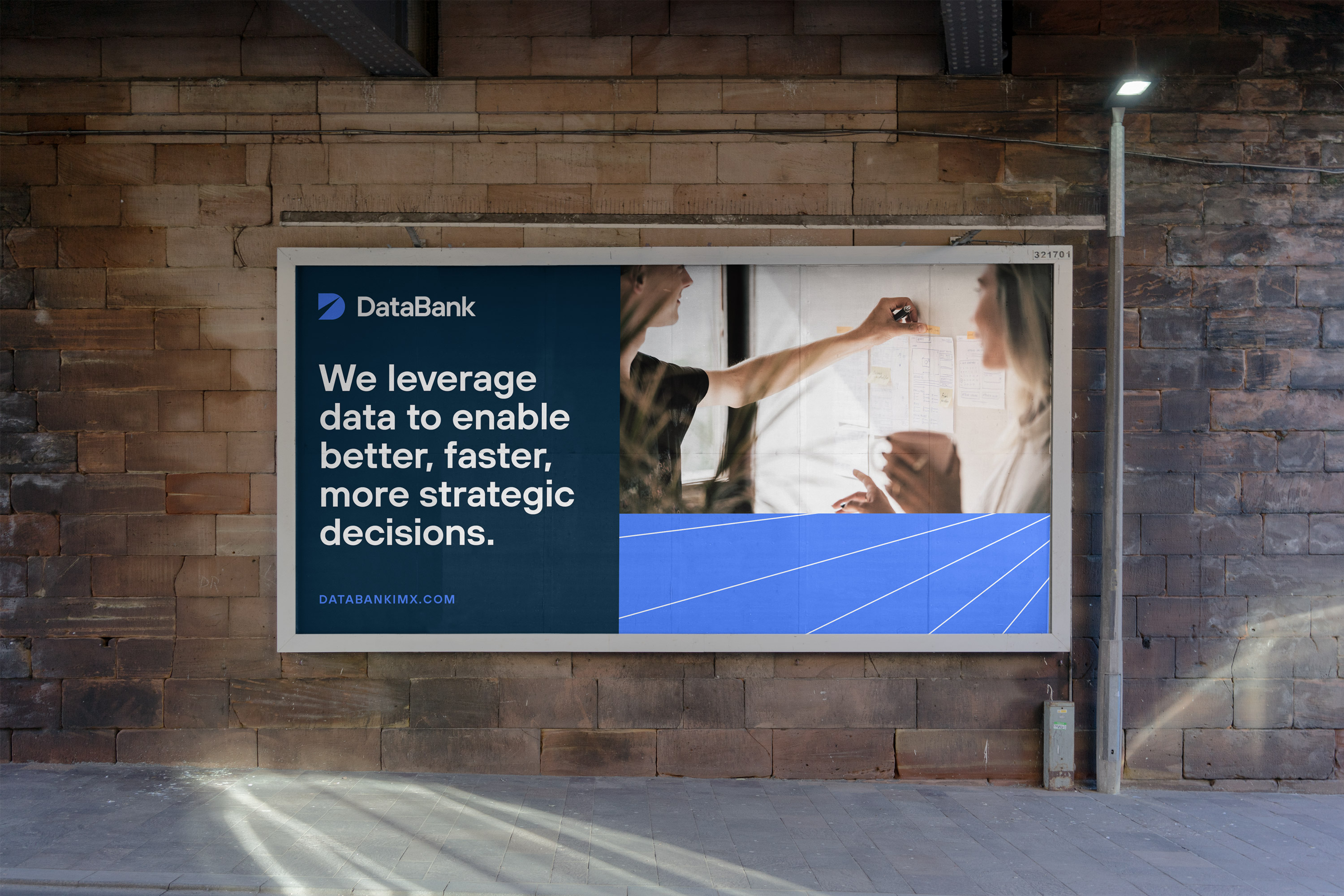
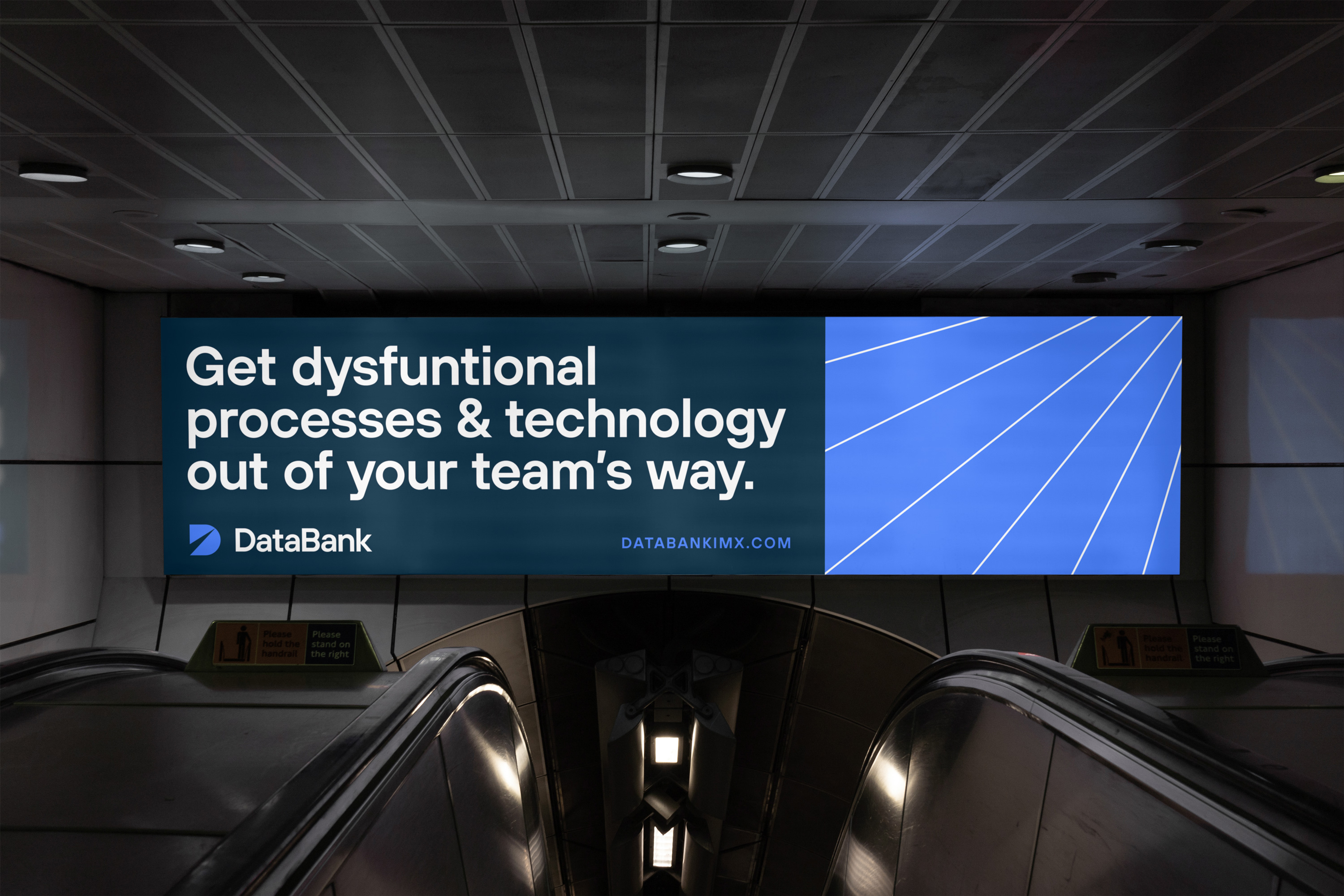
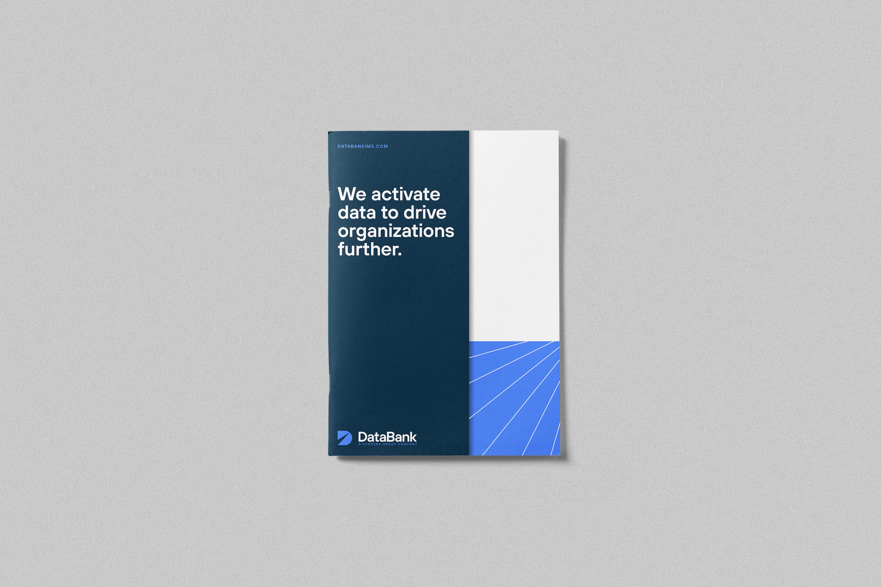
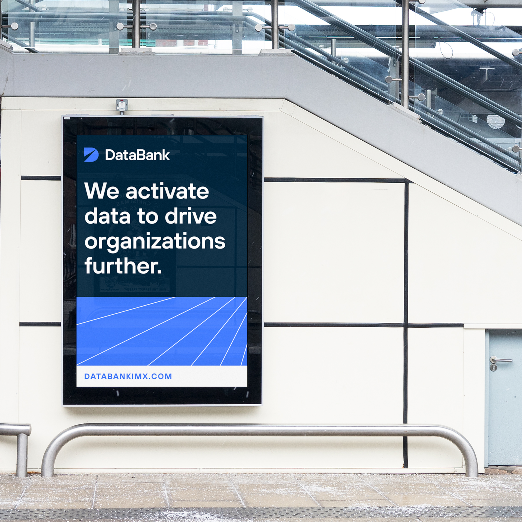
I worked with DataBank on a full brand identity refresh to reflect a shift in their brand positioning. After uncovering some misconceptions around their product offerings, the DataBank team focused their message into a core tenet: DataBank turns data into information, then activates it to drive organizations further. With that as the north star of the redesign, I knew the brand needed to feel that it was focused forward and had momentum, moving in a positive direction.
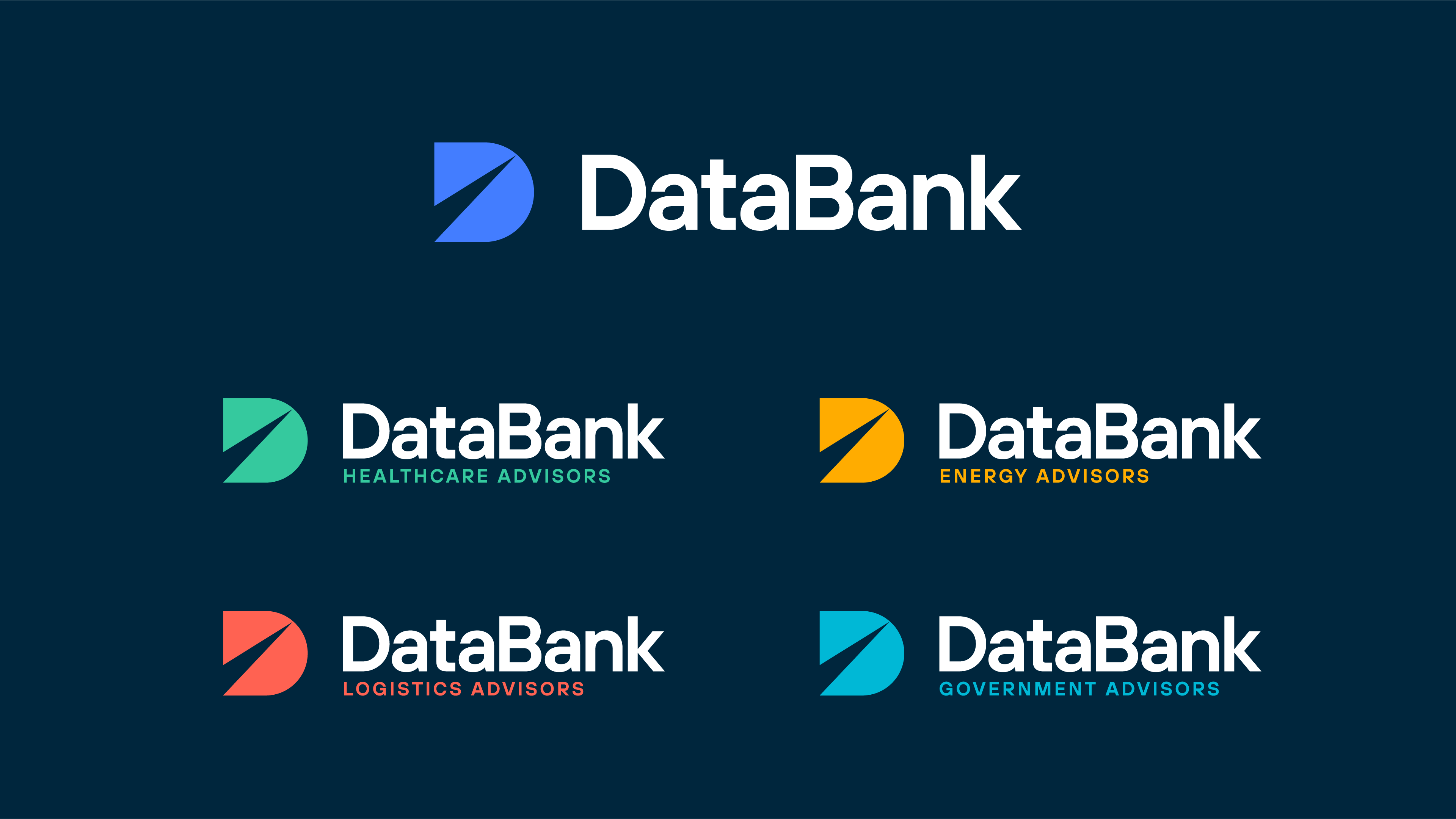
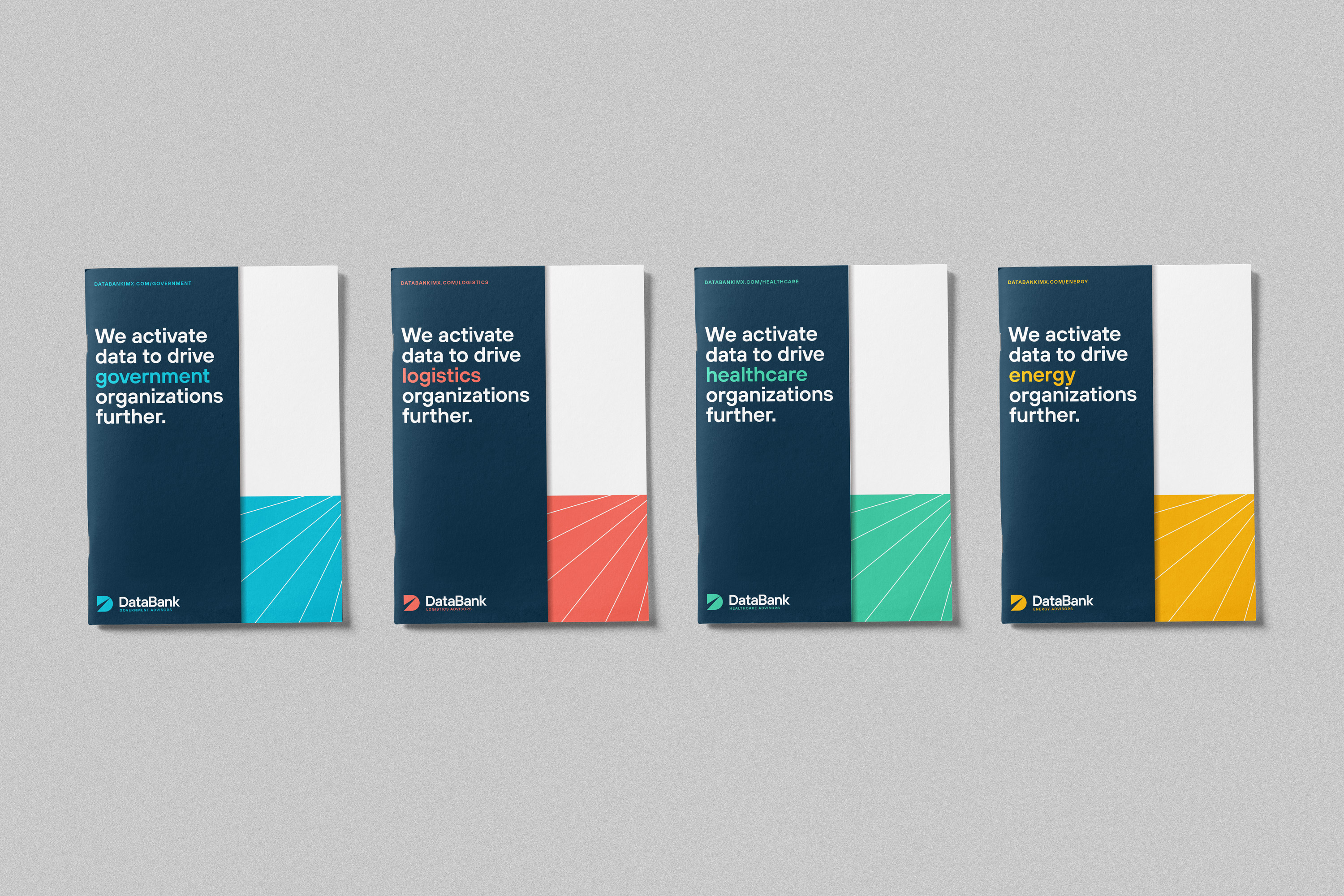
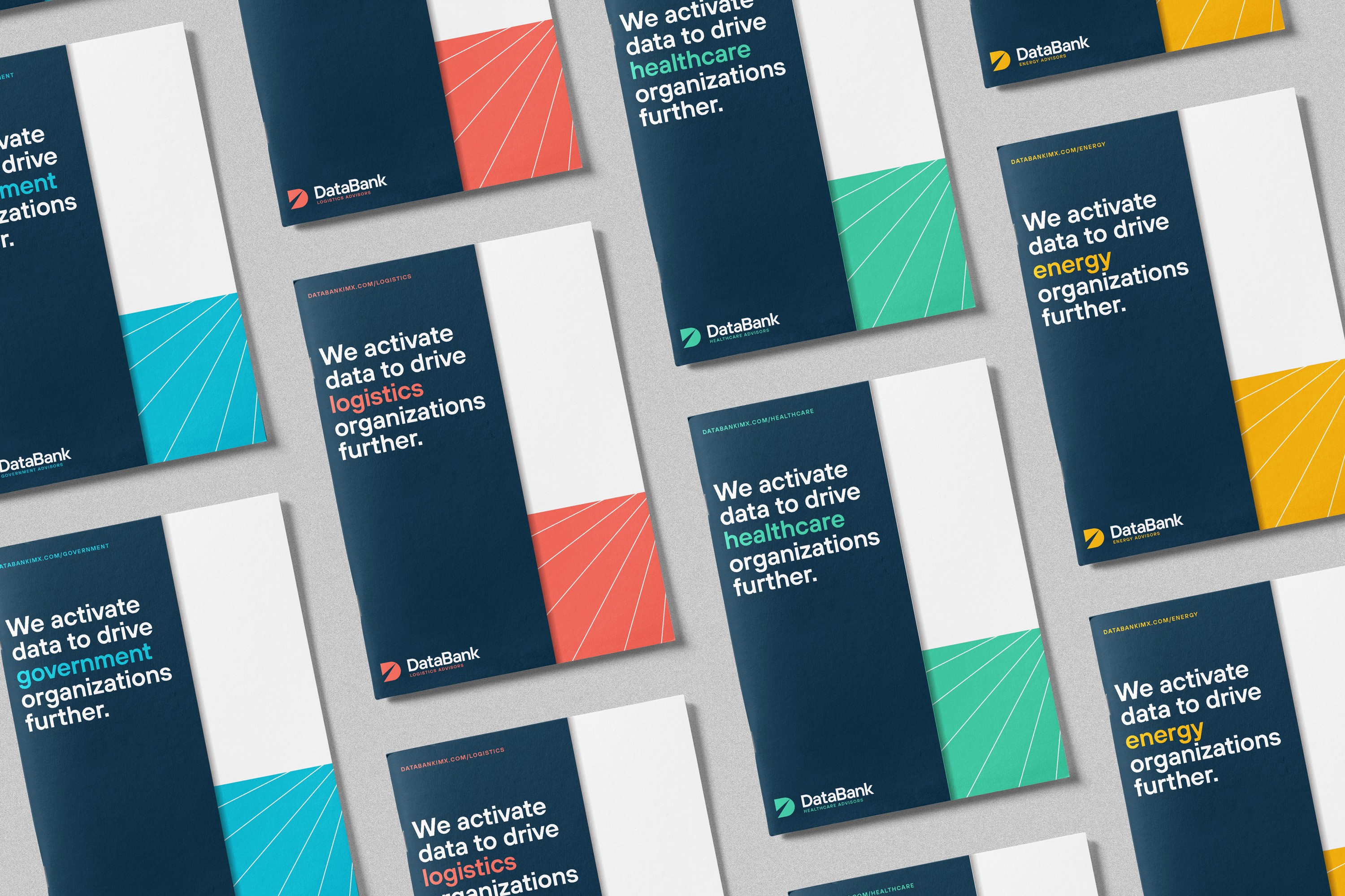
The brand identity flowed down into their sector-based subbrands as well, using an expanded color palette to denote their sectors of focus.
I worked with DataBank on a full brand identity refresh to reflect a shift in their brand positioning. After uncovering some misconceptions around their product offerings, the DataBank team focused their message into a core tenet: DataBank turns data into information, then activates it to drive organizations further. With that as the north star of the redesign, I knew the brand needed to feel that it was focused forward and had momentum, moving in a positive direction.
The brand identity flowed down into their sector-based subbrands as well, using an expanded color palette to denote their sectors of focus.
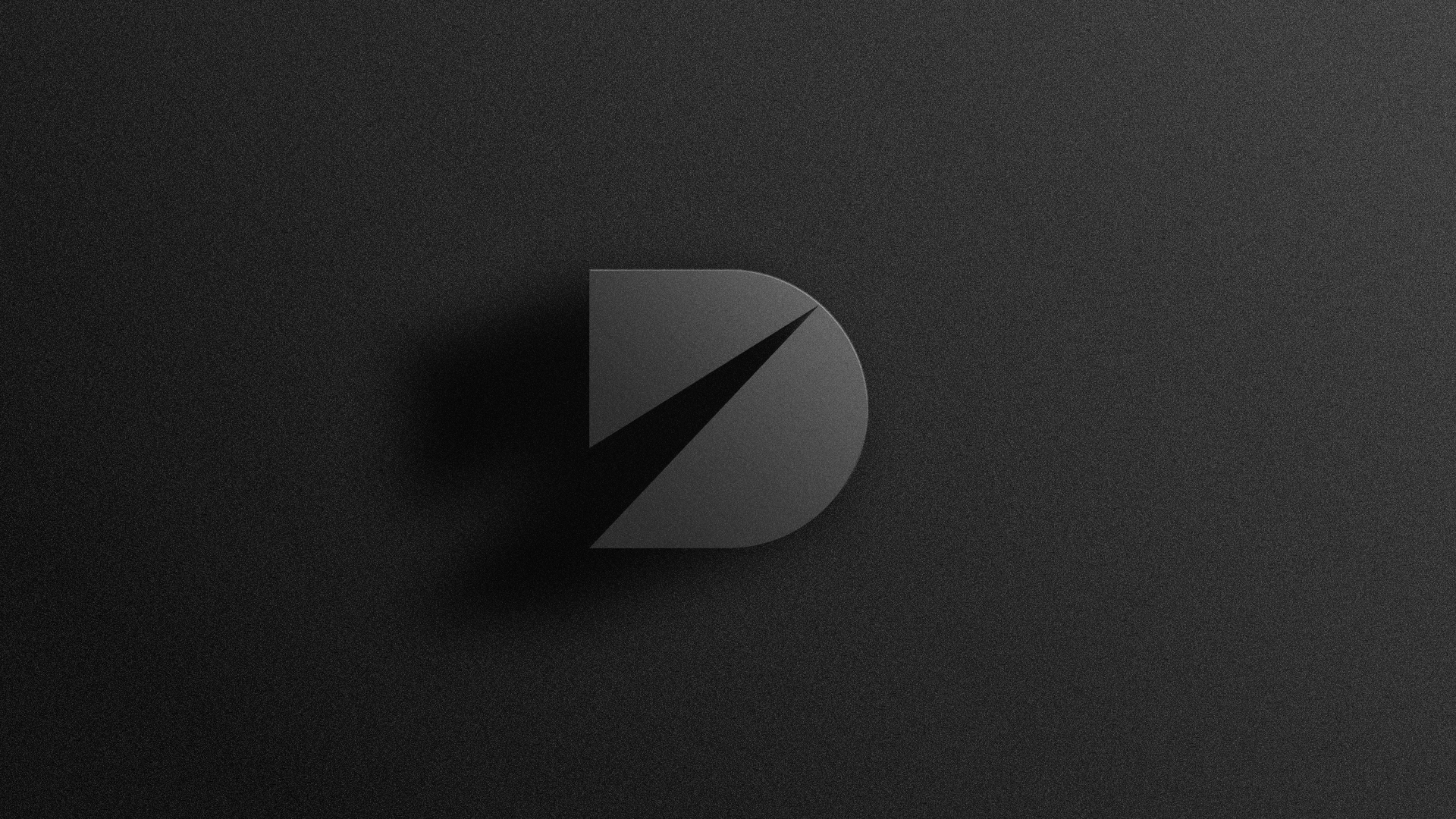
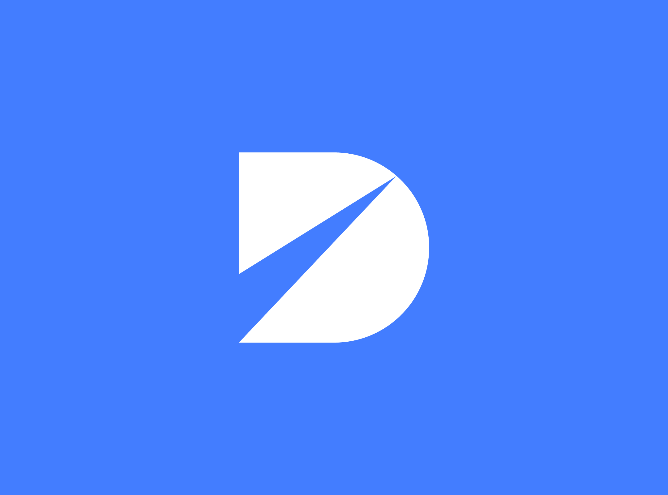
Within the brand brief, there were a few certain
phrases like “data refinement,” “creating
efficiencies,” “process improvement,” and
“moving forward” that continued to rise to the surface when brainstorming toward a visual concept. These ideas
are ultimately conveyed in the new DataBank
mark. The distinct pieces are converging
toward a common endpoint, representing the
common goals of DataBank and their clients. All of the elements are moving forward and upward, all contained in
a D letterform, representing DataBank.
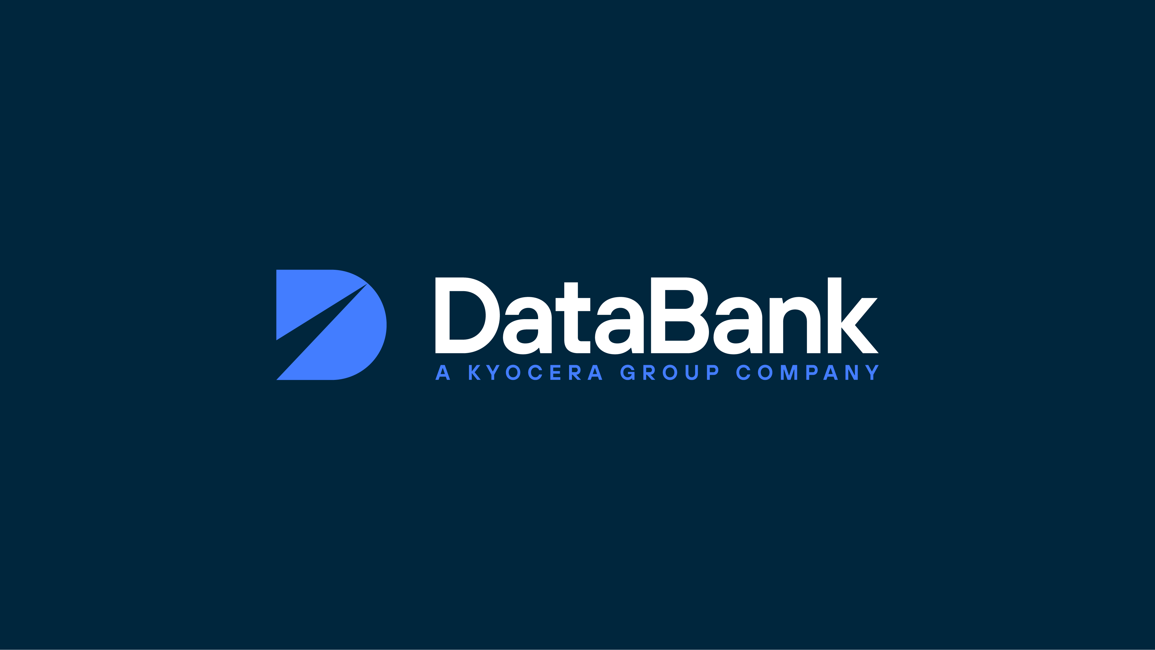
The end result is simple, memorable, extremely flexible, retaining clarity and readability at a full spectrum of sizes.
The end result is simple, memorable, extremely flexible, retaining clarity and readability at a full spectrum of sizes.

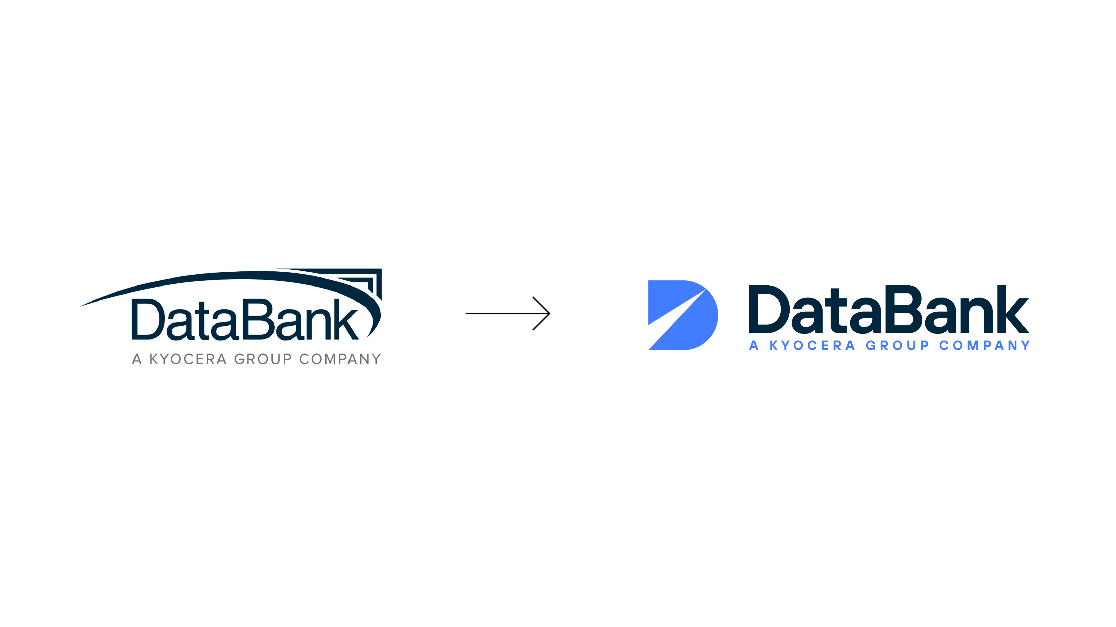
Logo evolution.

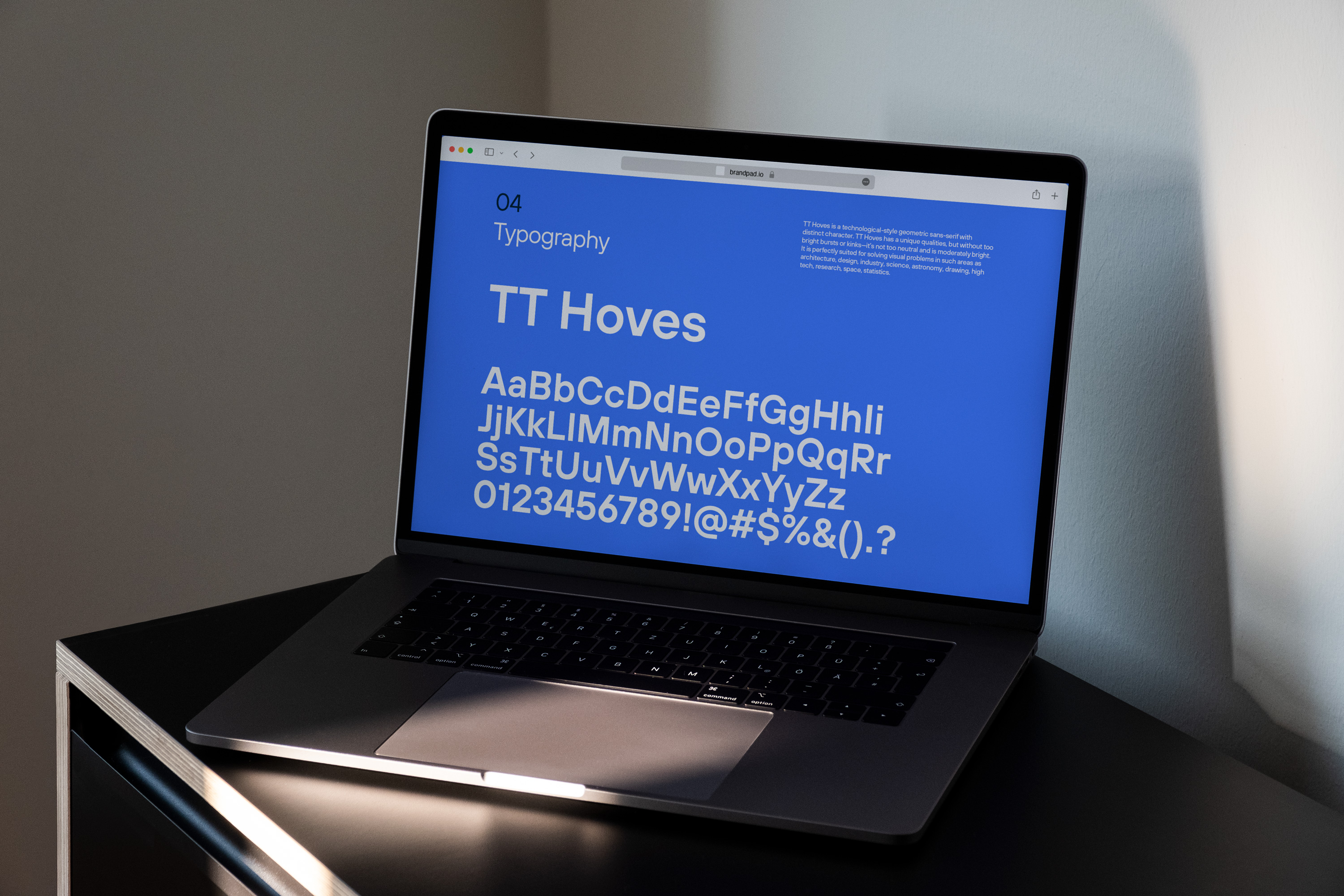
Digital brand guidelines delivered via Brandpad.